Plot with background in ggplot2: Visualising line-ups from Hurricane-festival 1997 – 2015
The Hurricane Festival is taking place again this june. It could be interesting to have a look on its development over the years. In this case, the amount of bands for each year.
First, i gathered some data from Wikipedia and put it in a csv-file. You can download the data here: Hurricane Festival Bands 1997–2015 (CSV).
A simple barplot is the best way to plot this data. But to make it a little more appealing, i want to use a custom font and a wallpaper from the Hurricane Festival website. But before i start plotting, i need to get the data in shape.
#These packages will be needed
library("dplyr")
library("tidyr")
library("ggplot2")
library("jpeg")
library("grid")
library("extrafont")

# read in the data
hurricane<-read.csv("Gesamt_1997_2015.csv", header=F, sep=";")
colnames(hurricane)<-c("bands","year")
With some Dplyr-magic we aggregate the count of bands per year:
# Group by year and count the number of bands in each year
plot.df<- hurricane %>% group_by(year) %>% summarise(count=n())
plot.df$year<-as.factor(plot.df$year)
I want to use the font „Open Sans“. Then you have to import it in R using the „extrafont“-package.
font_import(paths="/Open_Sans/")
loadfonts(device="win") #otherwise i get errors on my windows-PC
fonts()
As the title of this blog-entry suggests, i also want to use jpg-background for my graph. Now we can plot the data:
# Import the Wallpaper
img <- readJPEG("wallpaper-hurricane-1920-1080.jpg")

# start plotting
plot<-ggplot(plot.df,aes(x=year,y=count)) +
  annotation_custom(rasterGrob(img, width=unit(1,"npc"), height=unit(1,"npc")),
                    -Inf, Inf, -Inf, Inf) +
  scale_y_continuous(expand=c(0,0), limits = c(0,max(plot.df$count)*1.05))+
  geom_bar(stat="identity",fill="white",width=0.8)+
  geom_text(aes(label=plot.df$count), vjust=1.5,colour="black") +
  theme_bw() +
  theme(text=element_text(family="Open Sans"),
        plot.title = element_text(size = rel(1.5), face = "bold", vjust = 1.5),
        axis.line=element_blank(),
        axis.text.y=element_blank(),
        axis.title.y=element_blank(),
        axis.ticks.y = element_blank()) +
  ggtitle("How many Bands had each Hurricane-Festival in the years 1997-2015")+
  labs(x="@Niels_Bremen")
plot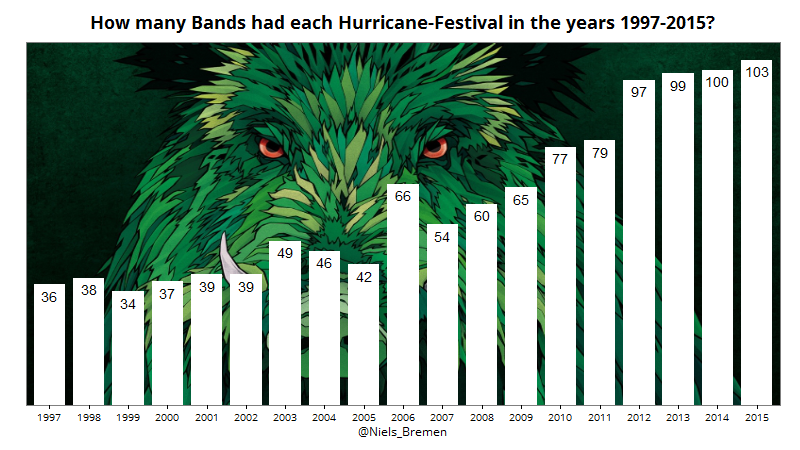
With „alpha=0.85“ the bars become a little bit transparent, so you can see a bit more of the background-image.
plot<-ggplot(plot.df,aes(x=year,y=count)) +
  annotation_custom(rasterGrob(img, width=unit(1,"npc"), height=unit(1,"npc")),
                    -Inf, Inf, -Inf, Inf) +
  scale_y_continuous(expand=c(0,0), limits = c(0,max(plot.df$count)*1.05))+
  geom_bar(stat="identity",fill="white",width=0.8, alpha=0.85)+
  geom_text(aes(label=plot.df$count), vjust=1.5,colour="black") +
  theme_bw() +
  theme(text=element_text(family="Open Sans"),
        plot.title = element_text(size = rel(1.5), face = "bold", vjust = 1.5),
        axis.line=element_blank(),
        axis.text.y=element_blank(),
        axis.title.y=element_blank(),
        axis.ticks.y = element_blank()) +
  ggtitle("How many Bands had each Hurricane-Festival in the years 1997-2015?")+
  labs(x="@Niels_Bremen")
plot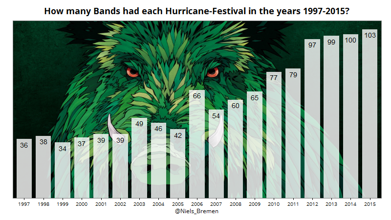
By the way, this is what the plot would look like with ggplot2-defaults. Not that bad, for just one line of code.
ggplot(plot.df,aes(x=year,y=count)) +geom_bar(stat="identity")Here, i tried to give one point for each time a band has played at hurricane-festival.
#only the Top29 Bands
plot.df2<-count.bands %>%
  filter(min_rank(desc(count)) <= 29) %>%
  arrange(desc(count))

#Preparing data for the plot
plot.df3 <- data.frame(band = rep(plot.df2$bands, plot.df2$count),
                      count = unlist(lapply(plot.df2$count, seq_len)))

#load font + background
font_import(paths="e:/Blog/Hurricane/Open_Sans/")
loadfonts(device="win"); fonts()
img <- readJPEG("e:/Blog/Hurricane/wallpaper-hurricane-800x450.jpg")

#plotting
ggplot(plot.df3, aes(x = count, y=reorder(band,count))) +
  annotation_custom(rasterGrob(img, width=unit(1,"npc"), height=unit(1,"npc")),
                    -Inf, Inf, -Inf, Inf)+
  geom_point(colour="white") +
  scale_x_continuous(limits=c(1, 7), breaks=seq(1,7, by=1)) +
  theme_bw()  +
  ggtitle("Most frequent bands at Hurricane-Festival (1997-2015)")+
  theme(text=element_text(family="Open Sans"),
        plot.title = element_text(size = rel(1.5), face = "bold", vjust = 1.5),
        axis.title.y=element_blank(),
        axis.ticks.y = element_blank(),
        axis.title.x=element_blank())
As a last plot, i did a wordcloud from all Bands that ever played at Hurricane.
library(wordcloud)
library(RColorBrewer)

#Plot and save wordcloud image
png('e:/wordcloud_hurricane.png', width=1200,height=1200,res=260)
wordcloud(count.bands$bands, count.bands$count2,
          scale = c(1.4, .2),
          min.freq=1,
          max.words=Inf,
          random.order=FALSE,
          rot.per=0,
          colors="Darkgreen",
          bg = "transparent")
dev.off()
Images in original: hurricane_final_resolution.png, hurricane-alpha.png, hurricane-default.png, Rplot-blog-final.png, wordcloud_hurricane.png