How to plot correlations of rating items with R
Especially when you´re starting a SEM-analysis you should have a look at your observed variables and the correlations between them. As usual with R, there´s an app a package for that. It´s called corrplot and seems to rely on base R graphics.
library("corrplot")
data(mtcars)
M <- cor(mtcars)

## different color scale and methods to display corr-matrix
corrplot(M, method="number", col="black", cl.pos="n")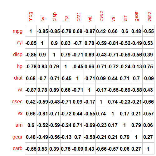
Pretty basic, huh? If you would rather have a good looking table, try the mighty sjPlot-package. It uses spearman-correlation as default.
sjPlot::sjt.corr(mtcars,
                 pvaluesAsNumbers=FALSE,
                 triangle="lower",
                 stringDiagonal=c(1,1,1,1,1,1,1,1,1,1),
                 CSS=list(css.thead="border-top:double black; font-weight:normal; font-size:0.9em;",
                          css.firsttablecol="font-weight:normal; font-size:0.9em;"))
Also thanks to the sjPlot-package from Daniel Lüdecke you only need this code:
sjp.corr(mtcars)to produce a correlation plot.
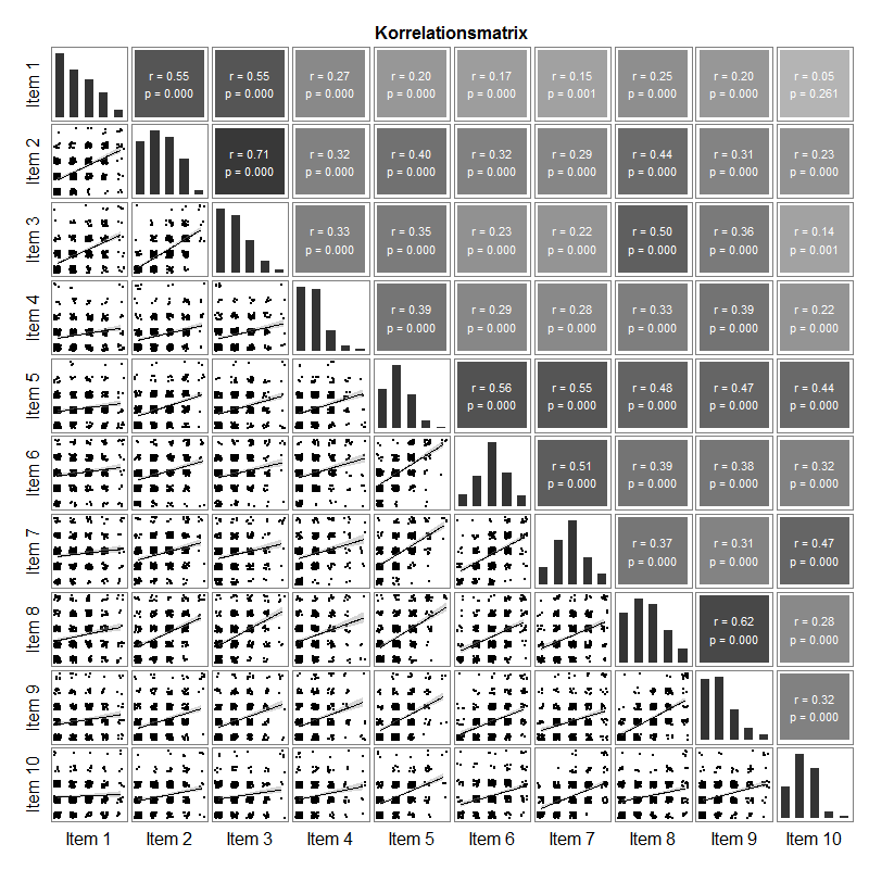
As usual, i´ve had my own thoughts on how a perfect correlation matrix for my sociological survey-data should look like. This was my idea: In the lower triangle it contains a jittered scatterplot of the responses. A scatterplot of rating-items with 5 categories does not work without jitter. Diagonally are the univariate distributions of the items as barplot, with one bar for each category. In the upper triangle you find the correlation (spearman) and p-value.
library("ggplot2")
library("plyr")
library("dplyr")
library("gtable")
library("sjPlot")

#pass the items as a dataframe to the function
dat<- yourdata %>% select(youritem1,youritem2...)

#------------
# Number of items, generate labels, and set size of text for correlations and item labels
n <- dim(dat)[2]
labels <- paste0("Item ", 1:n)
sizeItem = 16
sizeCor = 4

## List of scatterplots
scatter <- list()
for (i in 2:n) {
  for (j in 1:(i-1)) {
    df.point <- na.omit(data.frame(cbind(x = dat[ , j], y = dat[ , i])))
    p <- ggplot(df.point, aes(x, y)) +
      geom_jitter(size = .7, position = position_jitter(width = .2, height= .2)) +
      stat_smooth(method="lm", colour="black") +
      theme_bw() + theme(panel.grid = element_blank())
    name <- paste0("Item", j, i)
    scatter[[name]] <- p
  } }

## List of bar plots
bar <- list()
for(i in 1:n) {
  bar.df <- as.data.frame(table(dat[ , i], useNA = "no"))
  names(bar.df) <- c("x", "y")
  p <- ggplot(bar.df) +
    geom_bar(aes(x = x, y = y), stat = "identity", width = 0.6) +
    theme_bw() +  theme(panel.grid = element_blank()) +
    ylim(0, max(bar.df$y*1.05))
  name <- paste0("Item", i)
  bar[[name]] <- p
}

## List of tiles
tile <- list()
for (i in 1:(n-1)) {
  for (j in (i+1):n) {
    df.point <- na.omit(data.frame(cbind(x = dat[ , j], y = dat[ , i])))
    x = df.point[, 1]; y = df.point[, 2]
    correlation = cor.test(x, y,method="spearman",use="pairwise")
    cor <- data.frame(estimate = correlation$estimate,
                      statistic = correlation$statistic,
                      p.value = correlation$p.value)
    cor$cor = paste0("r = ", sprintf("%.2f", cor$estimate), "\n",
                     "p = ", sprintf("%.3f", cor$p.value))
    p <- ggplot(cor, aes(x = 1, y = 1)) +
      geom_tile(aes(fill = estimate)) +
      geom_text(aes(x = 1, y = 1, label = cor),
                colour = "White", size = sizeCor, show_guide = FALSE) +
      theme_bw() + theme(panel.grid = element_blank()) +
      scale_fill_gradient2(limits = c(-1,1), midpoint=0,low=("black"),mid="grey",high=("black"))
    name <- paste0("Item", j, i)
    tile[[name]] <- p
  } }

# Convert the ggplots to grobs, and select only the plot panels
barGrob <- llply(bar, ggplotGrob);     barGrob <- llply(barGrob, gtable_filter, "panel")
scatterGrob <- llply(scatter, ggplotGrob); scatterGrob <- llply(scatterGrob, gtable_filter, "panel")
tileGrob <- llply(tile, ggplotGrob);   tileGrob <- llply(tileGrob, gtable_filter, "panel")

## Set up the gtable layout
gt <- gtable(unit(rep(1, n), "null"), unit(rep(1, n), "null"))

# Bar plots along the diagonal
for(i in 1:n) gt <- gtable_add_grob(gt, barGrob[[i]], t=i, l=i)
# Scatterplots in the lower half
k <- 1
for (i in 2:n) for (j in 1:(i-1)) { gt <- gtable_add_grob(gt, scatterGrob[[k]], t=i, l=j); k <- k+1 }
# Tiles in the upper half
k <- 1
for (i in 1:(n-1)) for (j in (i+1):n) { gt <- gtable_add_grob(gt, tileGrob[[k]], t=i, l=j); k <- k+1 }

# Add item labels
gt <- gtable_add_cols(gt, unit(1.5, "lines"), 0)
gt <- gtable_add_rows(gt, unit(1.5, "lines"), 2*n)
for(i in 1:n) { textGrob <- textGrob(labels[i], gp = gpar(fontsize = sizeItem)); gt <- gtable_add_grob(gt, textGrob, t=n+1, l=i+1) }
for(i in 1:n) { textGrob <- textGrob(labels[i], rot = 90, gp = gpar(fontsize = sizeItem)); gt <- gtable_add_grob(gt, textGrob, t=i, l=1) }

# Add small gap between the panels
for(i in n:1) gt <- gtable_add_cols(gt, unit(0.2, "lines"), i)
for(i in (n-1):1) gt <- gtable_add_rows(gt, unit(0.2, "lines"), i)

# Add chart title
gt <- gtable_add_rows(gt, unit(1.5, "lines"), 0)
textGrob <- textGrob("Korrelationsmatrix", gp = gpar(fontface = "bold", fontsize = 16))
gt <- gtable_add_grob(gt, textGrob, t=1, l=3, r=2*n+1)

# Add margins to the whole plot
for(i in c(2*n+1, 0)) { gt <- gtable_add_cols(gt, unit(.75, "lines"), i); gt <- gtable_add_rows(gt, unit(.75, "lines"), i) }

# Draw it
grid.newpage()
grid.draw(gt)
Kudos to Stackoverflow User Sandy Muspratt for helping me to figure this out.