Drawing path diagrams of structural equation models (SEM) for publication
Visualisation of structural equation models is done with path diagrams. They are an important means to give your audience an easier access to the equation system, that represents the theory you want to test. A path diagram is kind of like a flow-chart that uses arrows to show direct and indirect causal links between your exogenous and endogenous variables, as well as your latent and your observed variables. The automatically produced path-diagrams are often good enough as you work out your model, but they´re not polished enough for publication. In this post, i´ll show a selection of tools and their output.
There are many software solutions to do structural equation modeling: LISREL, AMOS, MPLUS, STATA, SAS, EQS and the R-packages sem, OpenMX, lavaan, Onyx. Most of these solutions have a built-in possibility to visualize their models. AMOS is a special case, because the modeling is done via drawing path diagrams. Onyx can do this, too.
In my experience the other SEM-tools (LISREL, MPLUS, STATA) don´t produce very appealing diagrams. When it comes to the R-packages, there are significantly better attempts. As a third solution, you can just use usual graphics software and type parameter-estimates by hand.
Path diagrams consist of rectangles for observed variables, ellipses for latent variables, curves with arrow-heads on both sides for correlations and most important: straight lines with arrow-heads on one end as paths.
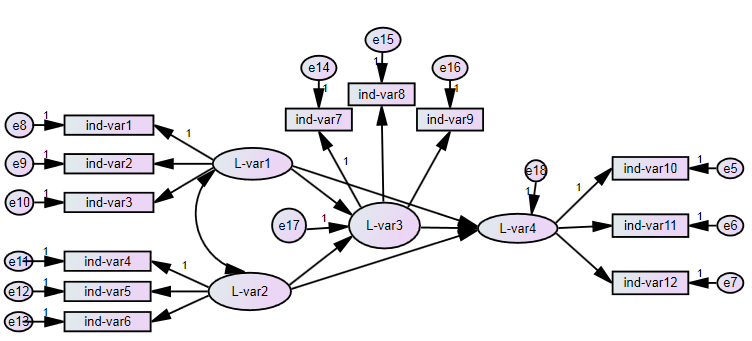
1. Solutions for automatical SEM-diagrams (commercial software) AMOS, LISREL and STATA approaches each produce their own style of diagram.
2. Built-in solutions for SEM-diagrams (R-packages)
- lavaan: For lavaan, the best way to get path diagrams would be the semPlot-package by Sascha Epskamp. It offers a fast and good solution for CFA-pathdiagrams or small SEM-pathdiagrams. Bigger pathdiagrams will need more work.
pathdiagram<-semPaths(fit,whatLabels="std", intercepts=FALSE, style="lisrel",
                       nCharNodes=0,
                       nCharEdges=0,
                       curveAdjacent = TRUE,title=TRUE, layout="tree2",curvePivot=TRUE)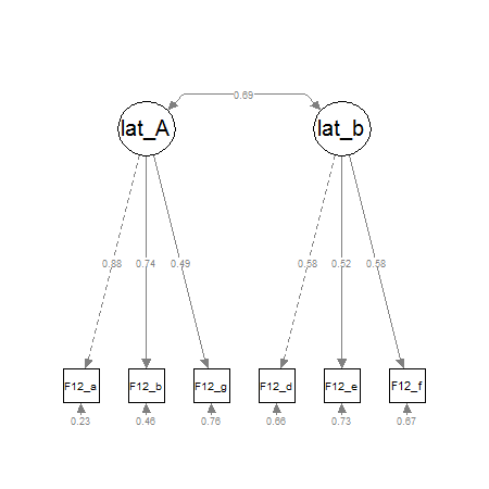
- sem: For the sem-package by John Fox, there is a function named „pathDiagram()“ which produces graphviz/dot-code that can be imported in graphviz.
- OpenMX: Exporting the model to dot-code and plotting it with graphviz is the recommended workflow.
- Onyx: Onyx by Andreas Brandmaier is a free standalone SEM-tool with an Amos-like graphical interface. Andreas Brandmaier wrote an experimental R-package that connects Onyx with R: https://github.com/brandmaier/onyxR
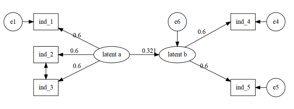
- DiagrammeR: Recommended by @timelyportfolio. It doesn´t import fit-models from SEM-packages, but has its strengths in an easy syntax.
devtools::install_github("rich-iannone/DiagrammeR")
library(DiagrammeR)

grViz("
digraph SEM {

graph [layout = neato, overlap = true, outputorder = edgesfirst]
node [shape = rectangle]

a [pos = '-4,1!', label = 'e1', shape = circle]
b [pos = '-3,1!', label = 'ind_1']
c [pos = '-3,0!', label = 'ind_2']
d [pos = '-3,-1!', label = 'ind_3']
e [pos = '-1,0!', label = 'latent a', shape = ellipse]
f [pos = '1,0!', label = 'latent b', shape = ellipse]
g [pos = '1,1!', label = 'e6', shape = circle]
h [pos = '3,1!', label = 'ind_4']
i [pos = '3,-1!', label = 'ind_5']
j [pos = '4,1!', label = 'e4', shape = circle]
k [pos = '4,-1!', label = 'e5', shape = circle]

a->b
e->b [label = '0.6']
e->c [label = '0.6']
e->d [label = '0.6']
e->f [label = '0.321', headport = 'w']
g->f [tailport = 's', headport = 'n']
d->c [dir = both]
f->h [label = '0.6', tailport = 'ne', headport = 'w']
f->i [label = '0.6']
j->h
k->i
}
")
Further references: Tristan Mahr’s proof-of-concept converting a lavaan-dataframe into node and edge dataframes for DiagrammeR (https://rpubs.com/tjmahr/sem_diagrammer); Andrey Lovakov’s example; Stas Kolenikov’s Graphviz example (http://staskolenikov.net/graphviz_sem.html).
3. other / graphics software (selection) If you want to use Graphviz or Tikz, you´ll get to very good looking diagrams, but you´ll also have to learn the „dot language“.
- Word / Power Point / libre Office / Draw
- inkscape
- yed
- Dia Portable
request for tipps I´m really looking out for best practices in drawing path diagrams for structural equation models. I think there´s a gap between working-state path-diagrams and diagrams suitable for publication.