Diverging stacked barchart for plotting likert Items
Questionnaires in the social sciences often include rating items to measure the variability of peoples´ attitudes towards something. Respondents are given a statement and have to report how much they agree or disagree on a 5- or 7-point-scale. A set of rating-items like these can be combined to a likert-scale. There´s still some controversy, if it´s adequate to use ranked (ordinal) data like likert-items to calculate means. Most researchers think it´s appropriate if the scale has at least 5 points and the variable can be considered as an ordinal measure of a continuous attitude.
Visualization of the data is always a good starting point. For this purpose, there are a lot of R-Packages like the HH-Package with its Likert-Function, or the likert-package from Jason Bryer and the sjp.likert-Function from Daniel Lüdecke, which would be my favourite.
All these packages produce sophisticated and very appealing plots. The HH-package uses lattice; the likert and sjPlot packages are built on ggplot2. The other two packages need raw-data (SPSS-like) and can´t work with already aggregated data. Long story short, i decided to use ggplot2 directly instead of using packages built on ggplot2.
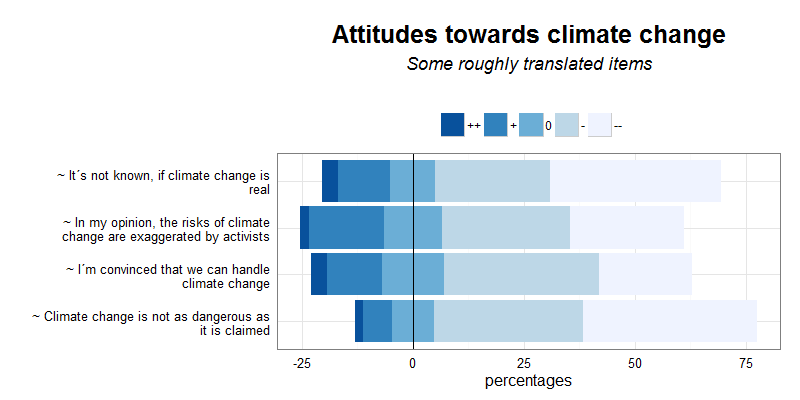
library("plyr")
library("dplyr")
library("ggplot2")

# example data
Variable<-c("1","1","1","1","1","2","2","2","2","2","3","3","3","3","3","4","4","4","4","4")
level<-c(5,4,3,2,1,5,4,3,2,1,5,4,3,2,1,5,4,3,2,1)
perc_w<-c(3.70,11.80,10.10,25.80,38.60,2.00,16.90,13.25,28.80,25.80,1.80,6.50,9.35,33.60,39.40,3.50,12.40,14.10,34.80,21.10)
df<-data.frame(Variable,level,perc_w)
df$perc_w<-as.numeric(df$perc_w)
df$level<-as.factor(df$level)

# item text
items<-c("~ It´s not known, if climate change is real",
         "~ In my opinion, the risks of climate change are exaggerated by activists",
         "~ Climate change is not as dangerous as it is claimed",
         "~ I´m convinced that we can handle climate change")

df$Variable<-as.character(df$Variable)
df$Variable[df$Variable==1]<-items[1]
df$Variable[df$Variable==2]<-items[2]
df$Variable[df$Variable==3]<-items[3]
df$Variable[df$Variable==4]<-items[4]
df$Variable<-as.ordered(df$Variable)

# calculate halves of the neutral category
df.split <-df %>% filter(level==3) %>% mutate(perc_w=as.numeric(perc_w/2))

# replace old neutral-category
df<-df %>% filter(!level==3)
df<-full_join(df,df.split) %>% arrange(level) %>% arrange(desc(Variable))

#split dataframe
df1<-df %>% filter(level == 3 | level== 2 | level==1)
df2<-df %>% filter(level == 5 | level== 4 | level==3) %>% mutate(perc_w = perc_w *-1)

# automatic line break
df1$Variable  <-str_wrap(df1$Variable, width = 41)
df2$Variable  <-str_wrap(df2$Variable, width = 41)

# reorder factor "Variable"
df1$Variable   <- factor(df1$Variable, levels=rev(unique(df1$Variable)))
df2$Variable   <- factor(df2$Variable, levels=rev(unique(df2$Variable)))

#Plot
p<-ggplot() +
  geom_bar(data=df1, aes(x = Variable, y=perc_w, fill = level, order = -as.numeric(level)),position="stack", stat="identity") +
  geom_bar(data=df2, aes(x = Variable, y=perc_w, fill = level, order = as.numeric(level)),position="stack", stat="identity") +
  geom_hline(yintercept = 0, color =c("black"))+
  theme_bw() +
  coord_flip() +
  guides(fill=guide_legend(title="",reverse=TRUE)) +
  scale_fill_brewer(palette="Blues", name="",labels=c("--","-","0","+","++")) +
  labs(title=expression(atop(bold("Attitudes towards climate change"),
                             atop(italic("Some roughly translated items"),""))),
       y="percentages",x="") +
  theme(legend.position="top",
        axis.ticks = element_blank(),
        plot.title = element_text(size=25),
        axis.title.y=element_text(size=16),
        axis.text.y=element_text(size=13),
        axis.title.x=element_text(size=16),
        axis.text.x=element_text(size=13),
        legend.title=element_text(size=14),
        legend.text=element_text(size=12))
p