Whereabouts of observations between multiple latent class models. Supplementary plot for LCA with poLCA.
I got the idea for the following plot and some of the code from a Stackoverflow question, where User D.L. Dahly tried to show how observations in „a model with class=(i) are distributed by the model with class = (i+1)“. I contribute through the idea of not using igraph, but the DiagrammeR-package, which generates an appealing plot with little code.
The plot tries to visualize how classifications of observations (persons) in a latent class analysis change over a sequence of LC-models with growing number of classes. I ran five models with one to five classes. The plot starts on top with the loglinear independence model that only has one class. The sample then splits in the 2-class LCA in a class with 146 and a class of 436 observations. Ellipse two and three are the classes 1 and 2 from the latent class model with two classes. In the next line of ellipses (four, five and six) you find the classes 1,2 and 3 of the latent class model with three classes. Ellipses seven, eight, nine, ten are classes 1,2,3 and 4 from the 4-class latent class model. The thickness of the ellipses and the arrows is according to the amount of observations.
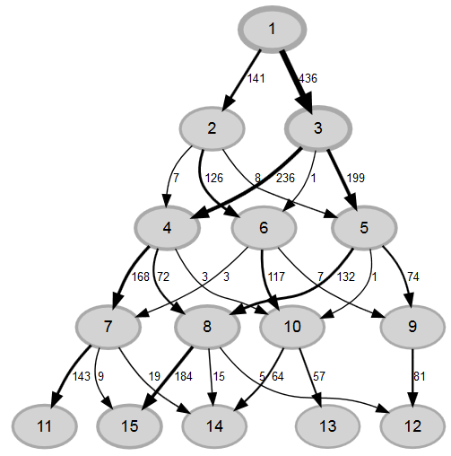
Here is the R-code for it:
# first: estimate 5 latent class models
f<-with(mydata, cbind(var1:varx)~1)
lc1<-poLCA(f, data=mydata, nclass=1, na.rm = FALSE, nrep=30, maxiter=3000) #Loglinear independence model.
lc2<-poLCA(f, data=mydata, nclass=2, na.rm = FALSE, nrep=30, maxiter=3000)
lc3<-poLCA(f, data=mydata, nclass=3, na.rm = FALSE, nrep=30, maxiter=3000)
lc4<-poLCA(f, data=mydata, nclass=4, na.rm = FALSE, nrep=30, maxiter=3000)
lc5<-poLCA(f, data=mydata, nclass=5, na.rm = FALSE, nrep=30, maxiter=3000)
#---------------------------------
# PLOT
#---------------------------------
library("DiagrammeR")
library("V8")
# This code stems from D.L. Dahly
# build dataframe with predicted class for each observation
x1<-rep(1, nrow(lc1$predclass))
x2<-lc2$predclass
x3<-lc3$predclass
x4<-lc4$predclass
x5<-lc5$predclass
results <- cbind(x1, x2, x3, x4, x5)
results <-as.data.frame(results)
results
# avoid double naming of classes (because each LCA named their classes 1,2,...,k)
N<-ncol(results)
n<-0
for(i in 2:N) {
results[,i]<- (results[,i])+((i-1)+n)
n<-((i-1)+n)
}
# Make a data frame for the edges and counts
# cross-tabulations and their frequencies
g1<-plyr::count(results,c("x1","x2"))
g2<-plyr::count(results,c("x2","x3"))
colnames(g2)<-c("x1","x2","freq")
g3<-plyr::count(results, c("x3","x4"))
colnames(g3)<-c("x1", "x2","freq")
g4<-plyr::count(results,c("x4","x5"))
colnames(g4)<-c("x1","x2","freq")
edges<-rbind(g1,g2,g3,g4)
# Make a data frame for the class sizes
h1<-plyr::count(results,c("x1"))
h2<-plyr::count(results,c("x2"))
colnames(h2)<-c("x1","freq")
h3<- plyr::count(results,c("x3"))
colnames(h3)<-c("x1","freq")
h4<-plyr::count(results,c("x4"))
colnames(h4)<-c("x1","freq")
h5<-plyr::count(results,c("x5"))
colnames(h5)<-c("x1", "freq")
nodes<-rbind(h1,h2,h3,h4,h5)Now, we use the data from edges and counts, as well as class sizes in DiagrammeR:
#dataframe for nodes - columns: node, label, type, attributes (like color and stuff)
colnames(nodes)<-c("node","label")

#scale nodes
nodes <- scale_nodes(nodes_df = nodes,
                     to_scale = nodes$label,
                     node_attr = "penwidth",
                     range = c(2, 5))

#dataframe for edges - columns: edge from, edge to, label, relationship, attributes
colnames(edges)<-c("from", "to", "label")
edges$relationship<-c("given_to")

#scale edges
edges <- scale_edges(edges_df = edges,
                     to_scale = edges$label,
                     edge_attr = "penwidth",
                     range = c(1, 5))

nodes <- scale_nodes(nodes_df = nodes,
                     to_scale = nodes$penwidth,
                     node_attr = "alpha:fillcolor",
                     range = c(5, 90))

nodes
nodes$label2<-nodes$label
nodes$label<-paste0(nodes$node)

#plot stuff
lca_graph<-create_graph(nodes,
                        edges,
                        node_attrs = c("fontname = Helvetica",
                                       "color = darkgrey",
                                       "style = filled",
                                       "fillcolor = lightgrey",
                                       "alpha_fillcolor = 0.5"),
                        edge_attrs = c("fontname = Helvetica",
                                       "fontsize=10"),
                        graph_attrs=c("layout=dot",
                                      "overlap = false",
                                      "fixedsize = true",
                                      "directed=TRUE"))

render_graph(lca_graph)
That´s it. DiagrammeR uses an algorithm to avoid overlapping. The only thing i miss in the plot are class-sizes. I tried to attach them with the „xlabel“-attribute in DiagrammeR, but the plot became too messy. You can try it yourself, by uncommenting this part:
nodes$label<-paste0(nodes$node, "',xlabel=","'",nodes$label2)But i didn´t like it much.