Visualisation of structural equation models is done with path diagrams. They are an important means to give your audience an easier access to the equation system, that represents the theory you want to test. A path diagram is kind of like a flow-chart that uses arrows to show direct and indirect causal links between your exogenous and endogenous variables, as well as your latent and your observed variables. As structural equation models can become complex and contain a lot of parameters to describe the relationships between observed and latent variables, it´s an important step to visualize them properly. The automatically produced path-diagrams are often good enough as you work out your model, but they´re not polished enough for publication. In this post, i´ll show a selection of tools and their output.
There are many software solutions to do structural equation modeling. LISREL, AMOS, MPLUS, STATA, SAS, EQS and the R-packages sem, OpenMX, lavaan, Onyx – just to name the most popular ones. Most of these solutions have a built-in possibility to visualize their models. AMOS is a special case, because the modeling is done via drawing path diagrams. Onyx can do this, too. This can make it easy, especially for beginners. Sometimes you can find these AMOS path diagrams beeing published in articles.
In my experience the other SEM-tools (LISREL,MPLUS,STATA) don´t produce very appealing diagrams. Especially if your model is a little bigger. When it comes to the R-packages, there are significantly better attempts to generate visualisations of structural equation models. As a third solution, you can just use usual graphics software and type parameter-estimates by hand. It seems to me, that – at this point – this will generate the highest quality path diagrams.
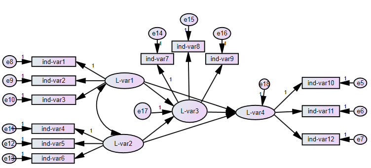
Path diagrams consist of rectangles for observed variables, ellipses for latent variables, curves with arrow-heads on both sides for correlations and most important: straight lines with arrow-heads on one end as paths, that link a predicting and a predicted variable. Here is an example of what it could look like:

In the rest of this blog entry, i will show you examples of path diagrams:
- 1. Commercial Software
- 2. R-Packages
- 3. Extern graphic software
1. Solutions for automatical SEM-diagrams (commercial software)
2. Built-in solutions for SEM-diagrams (R-packages)
There are several R-packages for SEM-analysis. The fit-objects of these packages can be visualized. This list is not complete.
- lavaan:
For lavaan, the best way to get path diagrams would be the semPlot-package by Sascha Epskamp (Project Homepage). Examples can be found here.
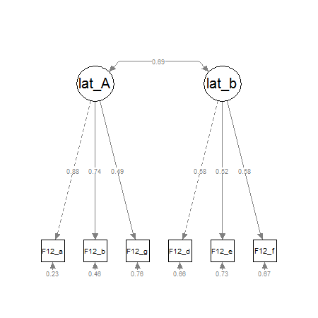
I don´t have much experience with the semPlot-package, but i think it´s offers a fast and good solution for CFA-pathdiagrams or small SEM-pathdiagram. Bigger pathdiagrams will need more work. Here´s a little example for a two-factor CFA:
pathdiagram<-semPaths(fit,whatLabels="std", intercepts=FALSE, style="lisrel",
                       nCharNodes=0,
                       nCharEdges=0,
                       curveAdjacent = TRUE,title=TRUE, layout="tree2",curvePivot=TRUE)
For the sem-package by John Fox , there is a function named „pathDiagram()“, which produces graphviz/dot-code that can be imported in graphviz. The dot-code is a description, that defines the latent and manifest variables as nodes and the interconnections as edges of a diagram.
The semPlot-package also supports the sem-package.
Screenshots can be found here.
UPDATE:
Andreas Brandmaier wrote an experimental R-package that connects his SEM-Tool Onyx with R. It can be found here https://github.com/brandmaier/onyxR. I haven´t tried it yet, but it seems to take models from lavaan or OpenMX (R) and tries to generate pathdiagrams from it. If this works, this blogpost is complete and will be rewritten shortly.
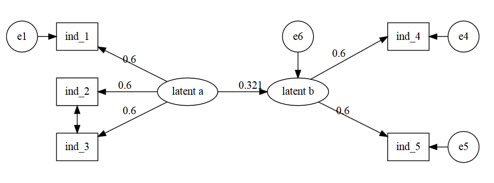
UPDATE: Richard Iannone produced this example for me on stackoverflow
devtools::install_github("rich-iannone/DiagrammeR")
library(DiagrammeR)

grViz("
digraph SEM {

graph [layout = neato,
       overlap = true,
       outputorder = edgesfirst]

node [shape = rectangle]

a [pos = '-4,1!', label = 'e1', shape = circle]
b [pos = '-3,1!', label = 'ind_1']
c [pos = '-3,0!', label = 'ind_2']
d [pos = '-3,-1!', label = 'ind_3']
e [pos = '-1,0!', label = 'latent a', shape = ellipse]
f [pos = '1,0!', label = 'latent b', shape = ellipse]
g [pos = '1,1!', label = 'e6', shape = circle]
h [pos = '3,1!', label = 'ind_4']
i [pos = '3,-1!', label = 'ind_5']
j [pos = '4,1!', label = 'e4', shape = circle]
k [pos = '4,-1!', label = 'e5', shape = circle]

a->b
e->b [label = '0.6']
e->c [label = '0.6']
e->d [label = '0.6']

e->f [label = '0.321', headport = 'w']
g->f [tailport = 's', headport = 'n']

d->c [dir = both]

f->h [label = '0.6', tailport = 'ne', headport = 'w']
f->i [label = '0.6']

j->h
k->i

}
"
This produces this path-diagram:

update on DiagrammeR for SEM
Recently Tristan Mahr blogged his proof-of-concept that it´s possible to convert a lavaan-dataframe into node and edge dataframes for DiagrammeR. Wow, i´m really curious if this approach will be pursued any further.
Here is the link: https://rpubs.com/tjmahr/sem_diagrammer
The psychologist Andrey Lovakov also did an example for a SEM pathdiagram with DiagrammeR: https://github.com/lovakov/Lecturers-Org-Commitment/blob/master/Figure%201
another update on pathdiagrams in R
Stas Kolenikov from the University of Missouri did another example for SEM-pathdiagrams in R on his website http://staskolenikov.net/graphviz_sem.html. Instead of DiagrammeR he uses Graphviz. A problem he encountered concerns displaying covariances by curved two-sided arrows. It´s possible to do this, but as he writes „their aesthetic appeal is probably not that great“.
3. other / graphics software (selection)
If you want to use Graphviz or Tikz, you´ll get to very good looking diagrams, but you´ll also have to learn the „dot language“. If you have to do a lot of diagrams it can be worth learning it, but for my purposes, it´s kind of overkill.
Here are some Graphviz-Examples: pathdiagram with Graphviz
This leads us to „normal“ multi-purpose graphics software. Doing the graphs with an office-suite is pretty straightforward and selfexplaining. On the other hand, i wouldn´t trust office that everything stays in its place, when i move it around in a document.
Inkscape is a tool, that´s often mentioned by SEM-analysts. At the moment, i´m giving yed a try, which seems to be easy and produce quick and good looking graphs. Dia could also be an alternative, but i haven´t tried it, yet.
request for tipps
I´m really looking out for best practices in drawing path diagrams for structural equation models. Please leave a comment, if you know another tool, that isn´t listed, or if you have a workflow, that can be adapted by others. I think there´s a gap between working-state path-diagrams and diagrams suitable for publication.

