Multiple Imputation in R. How to impute data with MICE for lavaan.
Missing data is unavoidable in most empirical work. This can be a problem for any statistical analysis that needs data to be complete. Structural equation modeling and confirmatory factor analysis are such methods that rely on a complete dataset. The following post will give an overview on the background of missing data analysis, how the missingness can be investigated, how the R-package MICE for multiple imputation is applied and how imputed data can be given to the lavaan-package for confirmatory factor analysis.
If you are in a hurry and already know the background of multiple imputation, jump to: How to use multiple imputation with lavaan
What kinds of missing data are there?
There are two types of missingness: Unit nonresponse concerns cases in the sample, that didn´t respond to the survey at all, or – more generally spoken – the failure to obtain measurements for a sampled unit. Item nonresponse occurs, when a person leaves out particular items in the survey, or – more generally spoken – particular measurements of a sampled unit are missing. Here, we will focus on item nonresponse.
Why is it important?
The topic of missing data itself is still often missing in the curriculum of statistics for social sciences and sociology. Also in practical research a lot of studies don´t show transparently how they handled missing data. But there would be a lot reason to pay more attention to this issue. As an example, Ranjit Lall examined how political science studies dealed with missing data and found out, that 50 % had their key results „disappear“ after he re-analysed them with a proper way to handle the missingness: How multiple Imputation makes a difference. Most of these studies used listwise deletion, because it once was a standard way to deal with missings and still is in many software packages. For example, the statistic software SPSS still doesn´t offer multiple imputation (only single imputation with EM-algorithm, that doesn´t incorporate uncertainty and should only be used with a trivial amount of missingness of < 5 %).
Regarding the state of the art right now, any researcher should take the following in consideration:
DON´T (bad practice)
In listwise deletion every observation (every row in the dataset respectively every person in the survey) that has at least one missing value will be dropped completely out of the analysis. Only complete cases are analysed. Another way is pairwise deletion, which often is used for correlations. Here, all cases without missings in the analysed variables are included. The problem is, that if you run a correlation of variable a and variable b, and a correlation of variable a and variable c, your results can be based on a different amount of cases (N).
Listwise and pairwise deletion are problematic in multiple ways: both reduce your samplesize and your statistical power decreases. Other studies acknowledge this problem and replace missing values with the mean value of the remaining datapoints (mean value replacement). This is problematic as well, because your standard deviation increases and your results become biased as well. It is still more accepted than listwise or pairwise deletion and has the convenience of having a single dataset for analysis.
DO: (state of the art)
The state of the Art methods of dealing with missing data (at least in structural equation modeling) are multiple imputation as well as full information maximum likelihood (FIML). In FIML no data is imputed. Instead, an algorithm is used in your analysis (i.e. regression, structural equation modelling) that estimates your model and the missing values in one step, based on your model and all observed data in your sample. FIML should not be confused with EM-Imputation.
In multiple imputation each missing value is replaced (imputed) multiple times through a specified algorithm, that uses the observed data of every unit to find a plausible value for the missing cell. Every time a missing value is replaced through an estimated value, some uncertainty/randomness is introduced. This way, each of the resulting datasets differs a little bit, which brings the advantage of a more adequate estimation of variances.
How to use multiple imputation in practice
It is the decision of the researcher how many times the cells with missing data are imputed. There are rules of thumb and simulation studies to guide this decision. Often a minimum of 5 imputed datasets is enough, but some researchers think it should depend on the amount of missingness. At some point a greater number of imputation becomes obsolete. Depending on the number of variables and number of observations and the speed of your computer, it can take some hours to complete the calculations.
Multiple Imputation needs multivariate normality of the data and the missings ´should at least be MAR (missing at random). Simulation studies showed, that deviation of multivariate normality is not too problematic and even if the data is not MAR, multiple imputation showed itself as robust. Especially in comparison to listwise or pairwise deletion, multiple imputation produces more adequate results in spite of erroneous assumption of MAR or multivariate normality.
There are a lot of tools to do multiple imputation: Here is a list of multiple imputation software. The standalone Software NORM now also has an R-package NORM for R (package). Another R-package worth mentioning is Amelia (R-package). Now, we turn to the R-package MICE („multivariate imputation by chained equations“) which offers many functions to generate imputed datasets based on your missing data. MICE uses the pmm algorithm which stands for predictive mean modeling that produces good results with non-normal data. To be precise: Which algorithm is used for imputation depends on the variable and the decision of the analyst. We´ll come back to this later.
Three types of missingness
Before you start with imputing your data, you should check the type of missingness in your data. This is kind of a paradox. How can you say what pattern the missingness has, if you don´t know which values are missing? If you knew, you wouldn´t need to impute them, right? The Values could be missing just at random. Or it could be, that people with specific values on the variable in question chose to decline the answer. People with extreme values could be underrepresentated. It is our goal to make it plausible, that our missing Items are at least „missing at random“ (MAR).
There are three possible patterns of missingness:
– MCAR (Missing completely at random)
– MAR (Missing at random)
– NMAR (Not missing at random)
What are the reasons of missing data in particular cells of the dataset? It could happen in (manual) data entry or when people miss a question, because they were distracted. But it could also be, that a person refuses to answer a question, doesn´t have the knowledge, cognitive abilities or motivation to answer it, or the question itself is unclear. It is especially problematic if missing values are related to the (unobserved) value of the person in this variable. A typical example would be, that people refuse to answer questions on their income if it exceeds a certain amount. Or if you ask for the number of sex partners a person had and people with high numbers don´t answer it. In this case your data is not missing at random.
If your data is missing completely at random, there is no correlation between the missingness and the value the person would have, if there was a datapoint. To find out if your data is MCAR there is a statistical test called „little´s mcar test“, which tests the null hypothesis that data is completely missing at random. So you want it to be nonsignificant. Problem is, that it’s an omnibus test. It doesn’t tell you for each variable if its missingness is mcar, but only for a set of variables. A part of your data might be mcar, but another part not. The little-MCAR-Test will only test all data and discard MCAR. Also, it has assumptions like normality, so if your data doesn’t meet them, the test might tell you it’s not mcar even if it is. The “MissMech” package in R has tests to show if assumptions are met. Little´s MCAR-test is part of the „BaylorEdPsych“ Package. Please notice, that a maximum of 50 variables can be tested at once. I quess that this is an arbitrary value and it just doesn´t make sense, to perform Little´s MCAR-Test on more variables, because it would be most likely to become significant.
There is critic towards the naming of the missingness-patterns. If missings are random, they are random. There is no sense in saying they miss „completely at random“. That´s why some people argue, that MCAR should just be named MAR. MAR on the other hand should be called MCAR, but with the letters staying for Missing CONDITIONALLY at random, because that´s what MAR (in its original meaning) is about. But, that critic won´t change the differentiation of MCAR, MAR and NMAR because they are already a scientific convention.
Let´s do a „Little´s test“ on MCAR:
#--------------------------------------------------
# Little-test
#--------------------------------------------------
install.packages('BaylorEdPsych', dependencies=TRUE)
library(BaylorEdPsych)

# read example data
data(EndersTable1_1)

# run MCAR test
test_mcar<-LittleMCAR(EndersTable1_1)

# print p-value of mcar-test
print(test_mcar$p.value)
As a result we get
print(test_mcar$p.value)
[1] 0.01205778
which means, that the result is significant. The null-hypotheses, that our data is mcar, is rejected. Data is mcar if p > 0.05. There is a possibility, that the test failed, because the data are not normal and homoscedastic. We test this:
install.packages("MissMech")
library("MissMech")

#test of normality and homoscedasticity
out<-TestMCARNormality(EndersTable1_1)
print(out)
The Output:
Call:
TestMCARNormality(data = EndersTable1_1)

Number of Patterns:  2

Total number of cases used in the analysis:  17

 Pattern(s) used:
          IQ   JP   WB   Number of cases
group.1    1   NA    1                 8
group.2    1    1    1                 9


    Test of normality and Homoscedasticity:
  -------------------------------------------

Hawkins Test:

    P-value for the Hawkins test of normality and homoscedasticity:  0.4088643

    There is not sufficient evidence to reject normality
    or MCAR at 0.05 significance level
So the results of the test of MCAR for homogenity of covariances show us, that mcar was not rejected because of non-normality or heteroscedasticity. If the Hawkins-test becomes significant, the „MissMech“-package performs a nonparametric test on homoscedasticity. This way, it can show through the method of elimination if non-normality or heteroscedasticity is a problem.
OK. Back to our patterns of missingness: Our data is not MCAR, but that´s not too bad, because we only need our data to be MAR (Missing at random). MAR isn’t testable like mcar. If your data isn’t MCAR you can try to make plausible that your data is MAR through visualisation of the missingness pattern. Or you can show that missingness depends on other variables (like gender or sth else). If you find out that this is the case, you can include them as auxiliary variables in your imputation model. It´s best to have side-variables like socio-demographics from register-data that can be used to show if they are relevant for missingness.
You can create a dummy variable for missingness and use a t-test or chi-squre test to look for differences in other variables depending on the dummy variable groups.
If your data is NMAR (Not missing at random) you cannot ignore the missings and imputation is not an option. You then have to find a way of analysing your data adquately.
Visualisation of missing data patterns
First, we inspect the amount of missingness for every variable in our dataset.
library("dplyr")
#First: Check your missings:
# Proportion of Missingness
propmiss <- function(dataframe) {
  m <- sapply(dataframe, function(x) {
    data.frame(
      nmiss=sum(is.na(x)),
      n=length(x),
      propmiss=sum(is.na(x))/length(x)
    )
  })
  d <- data.frame(t(m))
  d <- sapply(d, unlist)
  d <- as.data.frame(d)
  d$variable <- row.names(d)
  row.names(d) <- NULL
  d <- cbind(d[ncol(d)],d[-ncol(d)])
  return(d[order(d$propmiss), ])
}

miss_vars<-propmiss(EndersTable1_1)
miss_vars_mean<-mean(miss_vars$propmiss)
miss_vars_ges<- miss_vars  %>% arrange(desc(propmiss))

plot1<-ggplot(miss_vars_ges,aes(x=reorder(variable,propmiss),y=propmiss*100)) +
  geom_point(size=3) +
  coord_flip() +
  theme_bw() + xlab("") +ylab("Missingness per variable") +
  theme(panel.grid.major.x=element_blank(),
        panel.grid.minor.x=element_blank(),
        panel.grid.major.y=element_line(colour="grey60",linetype="dashed")) +
  ggtitle("Percentage of missingness")
plot1
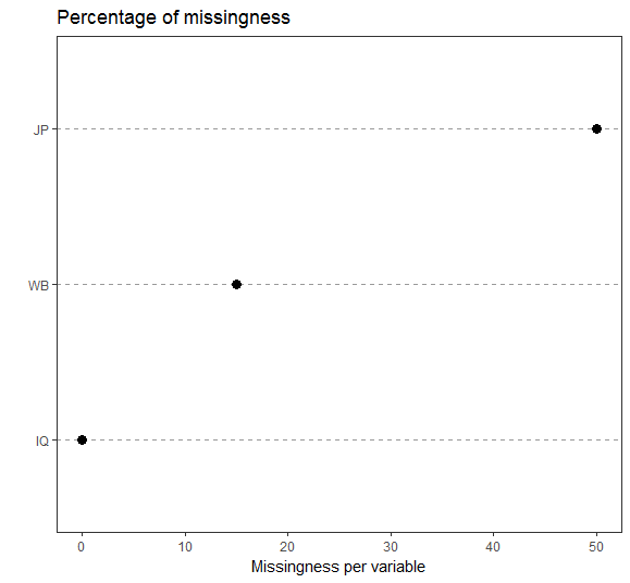
There is no general rule on how much missing data is acceptable. It depends on your research context and samplesize. Sometimes 20 % shouldn´t be exceeded, sometimes more than 40 % missings are not tolerable and sometimes 5 % missings is too much. You should check all cases with the most amount of missingness, if the person did the survey conscientious and if its data does add value to the quality of your dataset.
I usually inspect amount of missingness per variable and per person. Often more than 90 % of participants have less then 10 % missings, but two or three cases have as much as 50 % missings. Concerning the variables, you should check every variable with more than 5 % missingness. Did you have a neutral category? Was the question problematic? Too personal? Too difficult? Questions like this normally are answered in a pretest.
Now, we´ll use the VIM package to visualize missings and if there are any patterns.
install.packages("VIM", dependencies = TRUE)
install.packages("VIMGUI", dependencies = TRUE)
library("VIM")
library("VIMGUI")
VIMGUI()

# If you don´t like to use the GUI because of reproducibility, you can also use the console:
aggr(EndersTable1_1, numbers=TRUE, prop=TRUE, combined=TRUE, sortVars=FALSE, vscale = 1)
After we chose our dataframe from the environment, VIM gives us some plots to visualise our data:
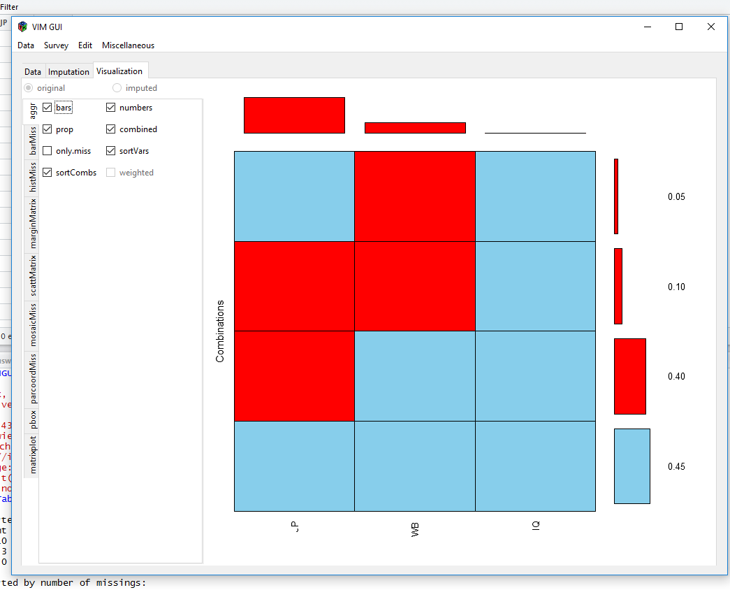
Aggregation Plot
or
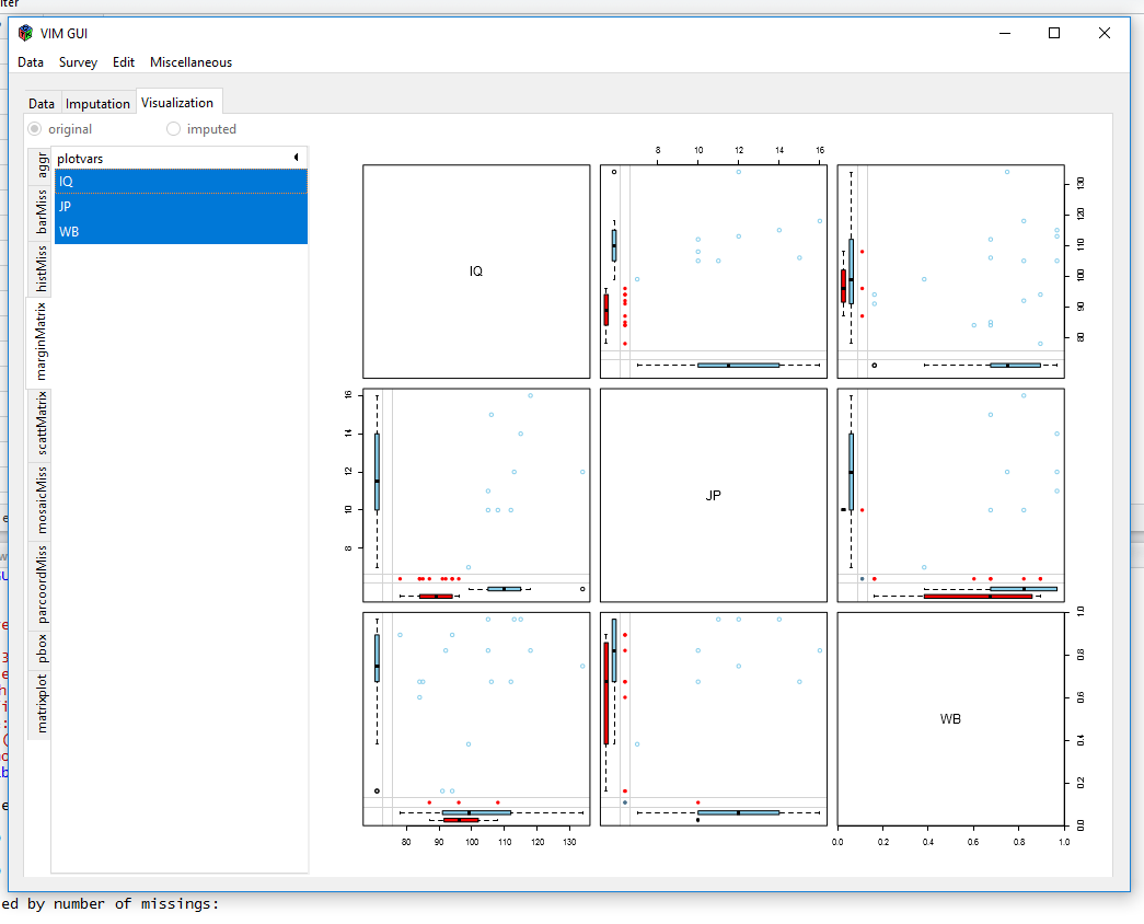
marginplot
Visualisiations like these show you, if there are a lot of different missing data patterns (~ random) or if there is some kind of systematics. The MICE-package can show missingness patterns as well:
install.packages("mice")
library(mice)
md.pattern(EndersTable1_1)

  IQ WB JP
9  1  1  1  0
8  1  1  0  1
1  1  0  1  1
2  1  0  0  2
   0  3 10 13
If you can make it plausible your data is mcar (non-significant little test) or mar, you can use multiple imputation to impute missing data. Generate multiple imputed data sets (depending on the amount of missings), do the analysis for every dataset and pool the results according to rubins rules.
How to use MICE for multiple imputation
With MICE you can build an imputation model that is tailored for your dataset. At first this can be a little overwhelming, so we start easy. Just use "mice()" with your dataframe and use the defaults of the package.
imp <- mice(EndersTable1_1)
imp
summary(imp)


> imp <- mice(EndersTable1_1)
 iter imp variable
  1   1  JP  WB
  1   2  JP  WB
  1   3  JP  WB
  1   4  JP  WB
  1   5  JP  WB
  2   1  JP  WB
  2   2  JP  WB
  2   3  JP  WB
  2   4  JP  WB
  2   5  JP  WB
  3   1  JP  WB
  3   2  JP  WB
  3   3  JP  WB
  3   4  JP  WB
  3   5  JP  WB
  4   1  JP  WB
  4   2  JP  WB
  4   3  JP  WB
  4   4  JP  WB
  4   5  JP  WB
  5   1  JP  WB
  5   2  JP  WB
  5   3  JP  WB
  5   4  JP  WB
  5   5  JP  WB
> imp
Multiply imputed data set
Call:
mice(data = EndersTable1_1)
Number of multiple imputations:  5
Missing cells per column:
IQ JP WB
 0 10  3
Imputation methods:
   IQ    JP    WB
   "" "pmm" "pmm"
VisitSequence:
JP WB
 2  3
PredictorMatrix:
   IQ JP WB
IQ  0  0  0
JP  1  0  1
WB  1  1  0
Random generator seed value:  NA
MICE generates 5 imputated datasets using an algorithm called "predictive mean matching" (pmm), because all data are "numeric" in this case. Pmm has the advantage of finding robust values if the data don´t follow a normal distribution.
If there was binary data like a factor with 2 levels MICE would have chosen "logistic regression imputation (logreg). If there was an unordered factor with more than 2 levels, MICE would have used "polytomous regression imputation for unordered categorical data" (polyreg). And if there were missings in a variable with more than 2 ordered levels, MICE would have used "proportional odds model" (polr).
There are many other algorithms for imputation that can be specified:
#Built-in elementary imputation methods are:

pmm
Predictive mean matching (any)

norm
Bayesian linear regression (numeric)

norm.nob
Linear regression ignoring model error (numeric)

norm.boot
Linear regression using bootstrap (numeric)

norm.predict
Linear regression, predicted values (numeric)

mean
Unconditional mean imputation (numeric)

2l.norm
Two-level normal imputation (numeric)

2l.pan
Two-level normal imputation using pan (numeric)

2lonly.mean
Imputation at level-2 of the class mean (numeric)

2lonly.norm
Imputation at level-2 by Bayesian linear regression (numeric)

2lonly.pmm
Imputation at level-2 by Predictive mean matching (any)

quadratic
Imputation of quadratic terms (numeric)

logreg
Logistic regression (factor, 2 levels)

logreg.boot
Logistic regression with bootstrap

polyreg
Polytomous logistic regression (factor, >= 2 levels)

polr
Proportional odds model (ordered, >=2 levels)

lda
Linear discriminant analysis (factor, >= 2 categories)

cart
Classification and regression trees (any)

rf
Random forest imputations (any)

ri
Random indicator method for nonignorable data (numeric)

sample
Random sample from the observed values (any)

fastpmm
Experimental: Fast predictive mean matching using C++ (any)
You can decide for each of your variables which imputation-algorithm is used. First you should make sure, every variable has the right type:
str(EndersTable1_1)

> str(EndersTable1_1)
'data.frame':	20 obs. of  3 variables:
 $ IQ: int  78 84 84 85 87 91 92 94 94 96 ...
 $ JP: int  NA NA NA NA NA NA NA NA NA NA ...
 $ WB: int  13 9 10 10 NA 3 12 3 13 NA ...
In this case every variable has the type integer. Just as an example, we assume that variable "WB" is an ordered factor.
EndersTable1_1$WB<-as.factor(EndersTable1_1$WB)
str(EndersTable1_1)

data.frame':	20 obs. of  3 variables:
 $ IQ: int  78 84 84 85 87 91 92 94 94 96 ...
 $ JP: int  NA NA NA NA NA NA NA NA NA NA ...
 $ WB: Factor w/ 8 levels "3","6","9","10",..: 7 3 4 4 NA 1 6 1 7 NA ...
Now we can use the argument "method = c('','pmm','polr')" in the mice()-call to specify the imputation algorithm for each variable.
As a default MICE also uses every variable in the dataset to estimate the missing values. This is usually called a "massive imputation". This can also be problematic, because variables that don´t correlate with the variable, that will be imputed, it only adds noise to the estimation. Leaving such a variable out of the imputation model can improve data quality. There is an easy way to build a "predictor matrix" using quickpred():
predictormatrix<-quickpred(EndersTable1_1,
                           include=c("IQ"),
                           exclude=NULL,
                           mincor = 0.1)
Here, i force MICE to include the Variable "IQ" in the predictor matrix. No variable is excluded a priori, but with "mincor = 0.1" i decide to only use variables as predictor in the imputation model, that are correlated with at least r=0.1 with the target-variable. Variables that are very weakly correlated are now left out. Also, your estimates can be biased if you include too many auxiliary variables.
Now comes an example for a more tailored imputation model. It is really just a simple demonstration. The imputation model should always be specifically be made for your dataset. First we build a predictormatrix, then we make sure, every variable is of the right type and then, we let mice generate 10 imputed datasets based on the algorithms we specified in the "method = " argument.
set.seed(121012)
predictormatrix<-quickpred(EndersTable1_1,
                           include=c("IQ"),
                           exclude=NULL,
                           mincor = 0.1)
str(EndersTable1_1)
EndersTable1_1<-as.data.frame(lapply(EndersTable1_1,as.numeric))
EndersTable1_1$WB<-as.factor(EndersTable1_1$WB)
str(EndersTable1_1)

imp_gen <- mice(data=EndersTable1_1,
                 predictorMatrix = predictormatrix,
                 method = c('pmm','pmm','polr'),
                 m=10,
                 maxit=5,
                 diagnostics=TRUE,
                 MaxNWts=3000)
Now, we inspect the imputed values and save the imputed datasets in one file.
# Check plausibility of the results
#Variable JP
imp_gen$imp$JP
nrow(imp$imp$JP)

#Variable WB
imp_gen$imp$WB
nrow(imp$imp$WB)


# bring your imputed data in long format (first colum ",.imp" is the number of imputation, the second column ".id" is the id of case)
imp_data<-mice::<-complete(imp_gen,"long",inc=FALSE)

# save data
write.table(comp10_neu,file="/imp_test.csv",sep=";")
How to use Multiple Imputation with lavaan
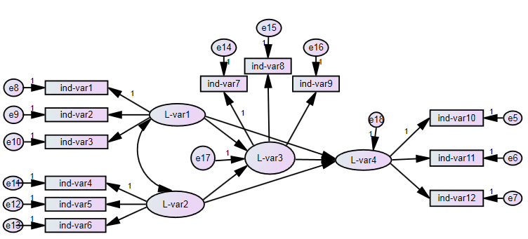
There are three ways to use multiple imputation in lavaan. The first (i) uses runMI() to do the multiple imputation and the model estimation in one step. The second (ii) does the multiple imputation with mice() first and then gives the multiply imputed data to runMI() which does the model estimation based on this data. Since both ways use runMI() they run the analysis multiple times for each imputed dataset and then use rubins rules to pool the results. Here is a diagram, showing the principle:

The third way (iii) uses the lavaan.survey()-package. In this example we don´t specify any sampling design or survey weight, but if you need to, it is possible. Here, you first use mice() to do the multiple imputation (if you use a survey weight, be sure to include it in the model) and then pass the imputed data to the survey-package and generate a svydesign()-object. This svydesign()-object can itself be passed to lavaan.survey, together with the lavaan-model. The way Lavaan.survey() uses multiple imputed data differs from runMI(). Here, not the results for each dataset are pooled after analysis, but the datasets are pooled first (to be precise: the variance-covariance are first calculated, taking account of the sampling design and then the matrices are pooled, which are the data basis for model estimation) and then only one dataset is analysed. The results can differ somewhat, but tend to be the same. Of course, you only use lavaan.survey() if you need to incorporate weights or a sampling design. It is evidend, that it will give more adequate results than using runMI() and omitting the weights, even though the pooling does not happen in the typical order.
Example:
#--------------------------
# Setting up packages
#--------------------------
install.packages("semTools","lavaan")
install.packages("survey")
install.packages("lavaan.survey")
install.packages("mitools")
install.packages("mice")
library("survey")
library("mice")
library("mitools")
library("semTools")
library("lavaan")
library("lavaan.survey")

#--------------------------
# Setting up example data and model
#--------------------------

# Create data with missings
set.seed(20170110)
HSMiss <- HolzingerSwineford1939[,paste("x", 1:9, sep="")]
randomMiss <- rbinom(prod(dim(HSMiss)), 1, 0.1)
randomMiss <- matrix(as.logical(randomMiss), nrow=nrow(HSMiss))
HSMiss[randomMiss] <- NA

# lavaan model
HS.model <- ' visual  =~ x1 + x2 + x3
textual =~ x4 + x5 + x6
speed   =~ x7 + x8 + x9 '
#------------------------------------------------------------------
# Variant 1: Imputation and model estimation with runmI
#-------------------------------------------------------------------

# run lavaan and imputation in one step
out1 <- runMI(HS.model,
              data=HSMiss,
              m = 5,
              miPackage="mice",
              fun="cfa",
              meanstructure = TRUE)
summary(out1)
fitMeasures(out1, "chisq")
At the moment you´ll get a warning:
** WARNING ** lavaan (0.5-22) model has NOT been fitted
** WARNING ** Estimates below are simply the starting values
You should just ignore it, because those warnings are side-effects from semtools and don´t have any meaning.
#------------------------------------------------------------------
# Variant 2: Imputation in step 1 and model estimation in step 2 with runMI
#-------------------------------------------------------------------

# impute data first
HSMiss_imp<-mice(HSMiss, m = 5)
mice.imp <- NULL
for(i in 1:5) mice.imp[[i]] <- complete(HSMiss_imp, action=i, inc=FALSE)

# run lavaan with previously imputed data using runMI
out2 <- runMI(HS.model,
              data=mice.imp,
              fun="cfa",
              meanstructure = TRUE)
summary(out2)
fitMeasures(out2, "chisq")
Here, we did the multiple imputation with mice() first and then passed the data to runMI(). In the first model we had a chisq of 73.841 and now chisq is 78.752. This might be, because of different imputation models.
#------------------------------------------------------------------
# Variant 3: Imputation in step 1 and model estimation in step 2 with lavaan.survey (but without weights)
#-------------------------------------------------------------------

# take previously imputed data from variant 2 and convert it to svydesign-object
mice.imp2<-lapply(seq(HSMiss_imp$m),function(im) complete(HSMiss_imp,im))
mice.imp2<-mitools::imputationList(mice.imp2)
svy.df_imp<-survey::svydesign(id=~1,weights=~1,data=mice.imp2)                    #survey-Objekt erstellen


# fit model with lavaan.survey
lavaan_fit_HS.model<-cfa(HS.model, meanstructure = TRUE)
out3<-lavaan.survey(lavaan_fit_HS.model, svy.df_imp)
summary(out3)
fitMeasures(out3, "chisq")
In this last model, the chisq is 96.748, which is somewhat higher than in model 1 (chisq = 73.841) or 2 (chisq = 78.752). That is due to the different pooling strategies. But, as i said before, using lavaan.survey() without weights or else, does not make sense. And if you need weights, using runMI() is no option.
Of course, you can also use the FIML-Method and just use the dataset with the missings. FIML does not work with lavaan.survey(), only with lavaan().
#------------------------------------------------------------------
# Variant 4: Use FIML (Full Information Maximum Likelihood) instead of multiple imputation
#-------------------------------------------------------------------

# fit model lavaan using FIML
out4<-cfa(HS.model, data=HSMiss, missing="FIML", meanstructure = TRUE)
summary(out4)
fitMeasures(out4, "chisq")
The chisquare is 76.13, which isn´t very different from the first to methods.
FIML is definitely easier to apply than multiple imputation, because you don´t have to work out an imputation model. On the other hand, you can´t specify an imputation model, which could come handy if your data is MAR and you want to include certain auxiliary variables. Also, if you decide to use lavaan.survey, you cannot use FIML, because it only supports multiply imputed data.