• about me
  • statistics
    • example data
  • twitter-mining (german)
  • raspberry pi (german)
  • links
  • Datenschutz
ahoi data

analysis, visualisation and playing around with data

rstats

Drawing path diagrams of structural equation models (SEM) for publication

2015-03-20 by Niels


Visualisation of structural equation models is done with path diagrams. They are an important means to give your audience an easier access to the equation system, that represents the theory you want to test. A path diagram is kind of like a flow-chart that uses arrows to show direct and indirect causal links between your exogenous and endogenous variables, as well as your latent and your observed variables. As structural equation models can become complex and contain a lot of parameters to describe the relationships between observed and latent variables, it´s an important step to visualize them properly. The automatically produced path-diagrams are often good enough as you work out your model, but they´re not polished enough for publication. In this post, i´ll show a selection of tools and their output.

There are many software solutions to do structural equation modeling. LISREL, AMOS, MPLUS, STATA, SAS, EQS and the R-packages sem, OpenMX, lavaan, Onyx – just to name the most popular ones. Most of these solutions have a built-in possibility to visualize their models. AMOS is a special case, because the modeling is done via drawing path diagrams. Onyx can do this, too. This can make it easy, especially for beginners. Sometimes you can find these AMOS path diagrams beeing published in articles.

In my experience the other SEM-tools (LISREL,MPLUS,STATA) don´t produce very appealing diagrams. Especially if your model is a little bigger. When it comes to the R-packages, there are significantly better attempts to generate visualisations of structural equation models. As a third solution, you can just use usual graphics software and type parameter-estimates by hand. It seems to me, that – at this point – this will generate the highest quality path diagrams.

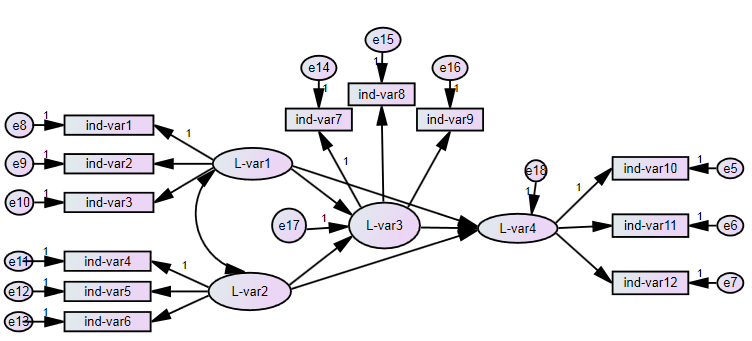
Path diagrams consist of rectangles for observed variables, ellipses for latent variables, curves with arrow-heads on both sides for correlations and most important: straight lines with arrow-heads on one end as paths, that link a predicting and a predicted variable. Here is an example of what it could look like:
SEM - path diagram

In the rest of this blog entry, i will show you examples of path diagrams:

      1. Commercial Software
      2. R-Packages
      3. Extern graphic software

1. Solutions for automatical SEM-diagrams (commercial software)

  • Here is an AMOS-Approach
  • Here is a Lisrel-Approach
  • Here is a STATA-Approach

2. Built-in solutions for SEM-diagrams (R-packages)
There are several R-packages for SEM-analysis. The fit-objects of these packages can be visualized. This list is not complete.

  • lavaan:
  • For lavaan, the best way to get path diagrams would be the semPlot-package by Sascha Epskamp (Project Homepage). Examples can be found here.

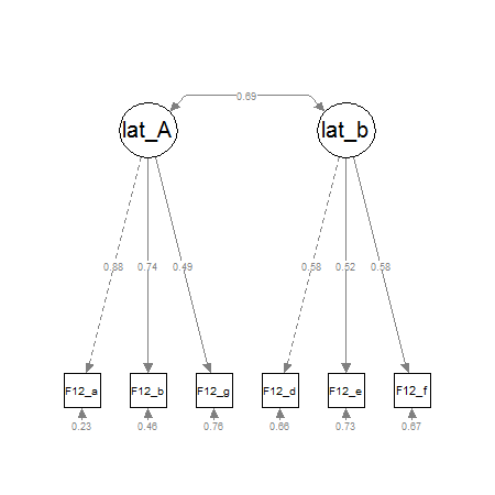
    I don´t have much experience with the semPlot-package, but i think it´s offers a fast and good solution for CFA-pathdiagrams or small SEM-pathdiagram. Bigger pathdiagrams will need more work. Here´s a little example for a two-factor CFA:

    pathdiagram<-semPaths(fit,whatLabels="std", intercepts=FALSE, style="lisrel",
                           nCharNodes=0, 
                           nCharEdges=0,
                           curveAdjacent = TRUE,title=TRUE, layout="tree2",curvePivot=TRUE)  
    

    CFA with semPlot

  • sem:
  • For the sem-package by John Fox , there is a function named „pathDiagram()“, which produces graphviz/dot-code that can be imported in graphviz. The dot-code is a description, that defines the latent and manifest variables as nodes and the interconnections as edges of a diagram.
    The semPlot-package also supports the sem-package.

  • OpenMX: For OpenMX, a free SEM-software that can be run via R. Exporting the model to dot-code and plotting it with graphviz is the recommended workflow.
  • Onyx: Onyx by Andreas Brandmaier is a free standalone SEM-tool. It offers an Amos-like graphical interface to specify the model and is capable of importing OpenMX-Code, but not lavaan-code.
  • Screenshots can be found here.
    UPDATE:
    Andreas Brandmaier wrote an experimental R-package that connects his SEM-Tool Onyx with R. It can be found here https://github.com/brandmaier/onyxR. I haven´t tried it yet, but it seems to take models from lavaan or OpenMX (R) and tries to generate pathdiagrams from it. If this works, this blogpost is complete and will be rewritten shortly.

  • DiagrammeR: Twitter-user @timelyportfolio (thank you!) recommended me the R-Package DiagrammeR by Richard Iannone. It doesn´t import fit-models from SEM-packages, but has it´s strengths in an easy syntax and fastly growing feature-list. I think, it´s very worthy to give it a try, because the path diagrams are not as hard to do as with graphviz but also reproducible.

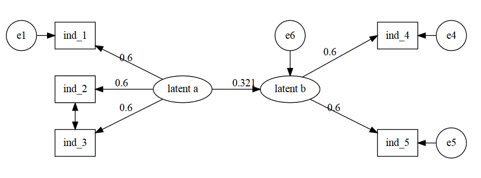
UPDATE: Richard Iannone produced this example for me on stackoverflow

devtools::install_github("rich-iannone/DiagrammeR")
library(DiagrammeR)

grViz("
digraph SEM {

graph [layout = neato,
       overlap = true,
       outputorder = edgesfirst]

node [shape = rectangle]

a [pos = '-4,1!', label = 'e1', shape = circle]
b [pos = '-3,1!', label = 'ind_1']
c [pos = '-3,0!', label = 'ind_2']
d [pos = '-3,-1!', label = 'ind_3']
e [pos = '-1,0!', label = 'latent a', shape = ellipse]
f [pos = '1,0!', label = 'latent b', shape = ellipse]
g [pos = '1,1!', label = 'e6', shape = circle]
h [pos = '3,1!', label = 'ind_4']
i [pos = '3,-1!', label = 'ind_5']
j [pos = '4,1!', label = 'e4', shape = circle]
k [pos = '4,-1!', label = 'e5', shape = circle]

a->b
e->b [label = '0.6']
e->c [label = '0.6']
e->d [label = '0.6']

e->f [label = '0.321', headport = 'w']
g->f [tailport = 's', headport = 'n']

d->c [dir = both]

f->h [label = '0.6', tailport = 'ne', headport = 'w']
f->i [label = '0.6']

j->h
k->i

}
"

This produces this path-diagram:
pathdiagrammR

update on DiagrammeR for SEM
Recently Tristan Mahr blogged his proof-of-concept that it´s possible to convert a lavaan-dataframe into node and edge dataframes for DiagrammeR. Wow, i´m really curious if this approach will be pursued any further.
Here is the link: https://rpubs.com/tjmahr/sem_diagrammer

The psychologist Andrey Lovakov also did an example for a SEM pathdiagram with DiagrammeR: https://github.com/lovakov/Lecturers-Org-Commitment/blob/master/Figure%201

another update on pathdiagrams in R
Stas Kolenikov from the University of Missouri did another example for SEM-pathdiagrams in R on his website http://staskolenikov.net/graphviz_sem.html. Instead of DiagrammeR he uses Graphviz. A problem he encountered concerns displaying covariances by curved two-sided arrows. It´s possible to do this, but as he writes „their aesthetic appeal is probably not that great“.

3. other / graphics software (selection)
If you want to use Graphviz or Tikz, you´ll get to very good looking diagrams, but you´ll also have to learn the „dot language“. If you have to do a lot of diagrams it can be worth learning it, but for my purposes, it´s kind of overkill.
Here are some Graphviz-Examples: pathdiagram with Graphviz

  • Graphviz
  • TikZ (LaTeX)

This leads us to „normal“ multi-purpose graphics software. Doing the graphs with an office-suite is pretty straightforward and selfexplaining. On the other hand, i wouldn´t trust office that everything stays in its place, when i move it around in a document.
Inkscape is a tool, that´s often mentioned by SEM-analysts. At the moment, i´m giving yed a try, which seems to be easy and produce quick and good looking graphs. Dia could also be an alternative, but i haven´t tried it, yet.

  • Word / Power Point / libre Office / Draw
  • inkscape
  • yed
  • Dia Portable

request for tipps
I´m really looking out for best practices in drawing path diagrams for structural equation models. Please leave a comment, if you know another tool, that isn´t listed, or if you have a workflow, that can be adapted by others. I think there´s a gap between working-state path-diagrams and diagrams suitable for publication.

Posted in: Uncategorized Tagged: AMOS, graphviz, lavaan, LISREL, MPLUS, Onyx, OpenMX, path diagrams, rstats, SEM, semPlot, SPSS, STATA, structural equation modeling, TikZ, visualisation

How to apply survey weights in structural equation modeling (SEM) with lavaan.

2015-03-17 by Niels

The R-Package lavaan is my favourite tool for fitting structural equation models (SEM). Its biggest advantages: It´s free, it´s open source and its range of functions is growing steadily.
Before lavaan, i used MPLUS, which still has the widest functionality of all SEM-Tools and is the most sophisticated software for latent variable modeling. The Muthéns and their MPLUS-team offer incredibly good support and documentation. The only problem is, that the software isn´t free and without a license you can´t get any of the support.
For me, one drawback of lavaan is, that it can´t model latent class models or mixture models …yet! Yves Rosseel is planning to add this in the next two years.

lavaan stands for „latent variable analysis“. The package is available via CRAN and has a good tutorial on the lavaan project homepage. Models are specified via syntax. Thankfully, the lavaan-syntax is kept pretty simple. At least, it´s a lot easier than the LISREL-syntax (the first, and original SEM-software). But it´s not as easy as drawing a path-model in AMOS, the SPSS-module. Anyway, once you get to a little more complex models, you´ll find working with syntax a lot more efficient. If you don´t like working with syntax, i recommend having a look at Onyx – a graphical interface for structural equation modeling by Andreas Brandmaier. It´s a free tool in which you can draw your SEM as a path diagram and generate the lavaan-syntax from it.
But, when you do SEM-models the syntax will be the least complicated thing you had to learn, so i don´t think that will be a problem at all.

Install lavaan
If you want to use survey weights, you have to install lavaan, the survey package and lavaan.survey. Lavaan is the package used for modeling and the survey-package converts your data into an survey-design-object. After you specified the model in a lavaan fit object and you have generated a survey-design-object from your data, these two objects are passed to the lavaan.survey function, which will calculate the weighted model.

First, you install the packages:

#Install lavaan
install.packages("lavaan", dependencies=TRUE)
library(lavaan)

#install lavaan.survey
install.packages("lavaan.survey")
library(lavaan.survey)

#Install survey-package
install.packages("survey")
library(survey)

Generate the survey-design object
After the packages and the data are loaded, a svydesign-object is generated from our data. It´s not a suprise, that with „id=~ID“ the column „ID“ in the dataframe will be used as id-variable. With „weights= ~weights_trunc“ the column which holds the survey-weights is defined and with „data=data“ the dataframe is chosen.

library("survey") #load survey package 
data<- read.csv(file = "data.csv", header=T, sep=",") #read data

#if necessary - recode missing value "9" to NA
df[df== 9] <- NA	

#generate survey-design object
svy.df<-svydesign(id=~ID, 
                  weights=~weight_trunc,
                  data=data)

Specifying the model
I´ll use a simple structural equation model with two latent variables, measured by three and two indicator-variables. The exogenous latent variable „latent_a“ is measured by x1-x3, the endogenous latent variable „latent_b“ is measured by y1-y2. The variable „latent_b“ is regressed on (predicted by) „latent_a“.

library(lavaan)
model_1 <- '# measurement model
              latent_a =~ F09_a + F09_b + F09_c
              latent_b =~ F12_a + F12_b 

             # regressions
              latent_b ~ latent_a
            '

lavaan.fit <- sem(model_1, 
                     data=data,                      
                     estimator="MLR", # robust fit / when you have missing data
                     missing = "ml",               #fiml for missing data
                     mimic="Mplus")

#you can run the model (unweighted) at this point and inspect it
summary(lavaan.fit,fit.measures=TRUE, standardized=TRUE)

Normally, i would use MLM as estimator to get robust estimates (robust against non-normality of the endogenous variable), but in this case i chose MLR, because FIML is not available with MLM.
FIML (Full Information Maximum Likelihood algorithm- defined with missing=“ml“) is regarded as equally efficiant to multiple imputation in handling item-nonresponse. But, it can be a good idea to do multiple imputation anyway, because bootstrapping the standard errors is only available with ML-estimator. On the other Hand, it´s an advantage that with FIML it´s not necessary to explicitly model missingess, because FIML uses the already specified SEM.

When using the lavaan.survey-package, you can´t use fiml (yet). You have to do a multiple imputation for your data, if you have missings, and instead of MLR lavan.survey uses MLM as default.

Fitting the model
When the model is fitted with lavaan.survey, the covariance-matrix will be estimated using the svyvar-object generated by the survey-package . The lavaan model uses this weighted covariance-matrix with the MLM-estimator to fit the model. MLM is not compatible with missing=“fiml“, so if your data has missings you have to do multiple imputation first and pass your imputed dataframes as a list to the svydesign-package so it becomes a svy.design-object which can be used as data in lavaan.survey. The resulting parameters, fit indices and statistics will be adjusted for the sampling design. Also, if MLM is used, the chi-square (likelihood-ratio) test-statistic will be transformed to a Satorra-Bentler corrected chi-square. [This information stems from the lavaan.survey documentation]. In lavaan, you can choose the form of your output. Because i worked a lot with MPLUS, i prefer the MPLUS-Output.

library(lavaan.survey)

#Fit the model using weighted data (by passing the survey-design object we generated above)
survey.fit <- lavaan.survey(lavaan.fit, 
                            survey.design, 
                            estimator="ML") 

#inspect output
summary(survey.fit,
        fit.measures=TRUE, 
        standardized=TRUE,
        rsquare=TRUE)

# if you´re interested in descriptive statistics
# you can access the missing data patterns 
inspect(fit, 'patterns') 

# and the coverage of the covariance matrix (like in MPLUS)
inspect(fit, 'coverage')


Results
I wouldn´t have expected that using weights in a SEM-analysis with lavaan is so easy to accomplish.
Here are the fit-indices of the weighted SEM.

lavaan (0.5-17) converged normally after  24 iterations

  Number of observations                           577

  Estimator                                         ML
  Minimum Function Test Statistic               11.664
  Degrees of freedom                                 4
  P-value (Chi-square)                           0.020

Model test baseline model:

  Minimum Function Test Statistic              955.394
  Degrees of freedom                                10
  P-value                                        0.000

User model versus baseline model:

  Comparative Fit Index (CFI)                    0.992
  Tucker-Lewis Index (TLI)                       0.980

Loglikelihood and Information Criteria:

  Loglikelihood user model (H0)              -3675.100
  Loglikelihood unrestricted model (H1)      -3669.268

  Number of free parameters                         16
  Akaike (AIC)                                7382.200
  Bayesian (BIC)                              7451.926
  Sample-size adjusted Bayesian (BIC)         7401.132

Root Mean Square Error of Approximation:

  RMSEA                                          0.058
  90 Percent Confidence Interval          0.021  0.097
  P-value RMSEA <= 0.05                          0.314

Standardized Root Mean Square Residual:

  SRMR                                           0.022

…and so on. I don´t show the whole results.

It´s common to show the parameter-estimates in a path-diagram. In my next blogging-session i´ll demonstrate how to draw path diagrams of a lavaan-model with SEMPLOT (Project Homepage).

Posted in: lavaan, rstats, SEM, structural equation modeling, survey, weights Tagged: lavaan, lavaan.survey, rstats, SEM, structural equation modeling, survey weights

Twitter-mining mit R – Teil 4: Sentiment Analysis mit R

2014-12-22 by Niels

Sentiment Analysis ist die „Stimmungsanalyse“ eines Textes. Beispielsweise werden Tweets dahingehend klassifiziert, dass sie eher positiven oder negativen Inhalt haben. Hierfür gibt es zwei Ansätze:

  • per Lernalgorithmus
  • lexikalisch

Ich verwende in diesem Beispiel die zweite Variante und werde einen lexikalischen Abgleich vornehmen, um die Tweets entsprechend ihres Wortinhalts als eher positiv oder eher negativ einzuordnen. Hierfür verwende ich eine Funktion von Jeffrey Breen:

score.sentiment = function(sentences, pos.words, neg.words, .progress='none')
{
  require(plyr)
  require(stringr)
  # we got a vector of sentences. plyr will handle a list
  # or a vector as an "l" for us
  # we want a simple array ("a") of scores back, so we use
  # "l" + "a" + "ply" = "laply":
  scores = laply(sentences, function(sentence, pos.words, neg.words) {   
    # clean up sentences with R's regex-driven global substitute, gsub():
    sentence = gsub('[[:punct:]]', '', sentence)
    sentence = gsub('[[:cntrl:]]', '', sentence)
    sentence = gsub('\\d+', '', sentence)
    # and convert to lower case:
    sentence = tolower(sentence)
    # split into words. str_split is in the stringr package
    word.list = str_split(sentence, '\\s+')
    # sometimes a list() is one level of hierarchy too much
    words = unlist(word.list)
    # compare our words to the dictionaries of positive & negative terms
    pos.matches = match(words, pos.words)
    neg.matches = match(words, neg.words)
    # match() returns the position of the matched term or NA
    # we just want a TRUE/FALSE:
    pos.matches = !is.na(pos.matches)
    neg.matches = !is.na(neg.matches)
    # and conveniently enough, TRUE/FALSE will be treated as 1/0 by sum():
    score = sum(pos.matches) - sum(neg.matches)
    return(score)
  }, pos.words, neg.words, .progress=.progress )
  scores.df = data.frame(score=scores, text=sentences)
  return(scores.df)
}

Die obige Funktion übernimmt die Kategorisierung. Nun fehlen noch die Tweets, für die ein Sentiment-Score errechnet werden soll und jeweils eine Wortliste mit positiven und negativen Worten, die hierfür verwendet wird.

Verbindung zu Twitter herstellen, Tweets abfragen und Wortliste downloaden

#-----------------------------------------------------
# --- Mit Twitter verbinden ---
#-----------------------------------------------------
library(twitteR)
# Authentifizierungsschlüssel eingeben
api_key <- "**************************"
api_secret <- "***************************"
access_token <- "*****************************"
access_token_secret <- "******************************"
setup_twitter_oauth(api_key,api_secret,access_token,access_token_secret)
#Tweet-Abfrage
hashtag.tweets = searchTwitter('LeaveItIn2014', n=900)
Tweets.text = laply(hashtag.tweets,function(t)t$getText())

#Emoticons in Tweets verursachen manchmal Probleme
tryTolower = function(x)
{
  # create missing value
  # this is where the returned value will be
  y = NA
  # tryCatch error
  try_error = tryCatch(tolower(x), error = function(e) e)
  # if not an error
  if (!inherits(try_error, "error"))
    y = tolower(x)
  return(y)
}
Tweets.text<-sapply(Tweets.text, function(x) tryTolower(x))

#Wortliste downloaden
pos <-scan('https://raw.githubusercontent.com/jeffreybreen/twitter-sentiment-analysis-tutorial-201107/master/data/opinion-lexicon-English/positive-words.txt', what='character', comment.char=';')
neg <- scan('https://raw.githubusercontent.com/jeffreybreen/twitter-sentiment-analysis-tutorial-201107/master/data/opinion-lexicon-English/negative-words.txt', what='character', comment.char=';')

[/code]
<strong>Sentiment Score der Tweets berechnen und visualisieren</strong>
[code language="r"]
#--Sentiment 1 berechnen
analysis<-score.sentiment(Tweets.text, pos, neg)
table(analysis$score)

library(ggplot2)
ggplot(analysis,aes(score)) + geom_bar(stat="bin",binwidth=1) +theme_bw() +scale_fill_brewer() + ggtitle("Sentiment-Score zu Hashtag `LeaveItin2014`")

Dies erzeugt folgende Grafik:Sentiment Score
Unter dem Hashtag „Leaveitin2014“ twittern Menschen darüber, welche Erfahrungen, Handlungsweisen oder Einstellungen sie nicht mit ins neue Jahr nehmen wollen. Hier wird also eine Art subjektiver Bilanz für 2014 gezogen und in Vorsätze für 2015 umgewandelt. Der Graph ist so, wie er sich hier darstellt nicht ganz korrekt. Der größte Balken steht für den Sentiment-Score von Null, ist hier jedoch auf der X-Achse zwischen 0 und 1 angesiedelt. Besser wäre es, er würde durch die „0“ in der Mitte geteilt. Das werde ich bei Gelegenheit noch nachbessern.
Der Sentiment-Score der Tweets zum Hashtag „Leaveitin2014“ reicht von -7 (sehr negativ) bis 3 (moderat positiv). Null ist der Mittelpunkt.

Sentiment-Score Vergleich von „climate change“ und „global warming“
Inspiriert von diesem Artikel wollte ich einmal testen, ob tweets sich hinsichtlich ihres Sentiment-Scores unterscheiden, wenn sie „climate change“ oder „global warming“ als Begriffe für dasselbe Phänomen verwenden.

#Tweets besorgen
library(plyr)
library(dplyr)
warming.tweets = searchTwitter('global warming', n=900)
warming.text = laply(warming.tweets,function(t)t$getText())
change.tweets = searchTwitter('climate change', n=900)
change.text = laply(change.tweets,function(t)t$getText())

#Formatierung 
tryTolower = function(x)
{
  # create missing value
  # this is where the returned value will be
  y = NA
  # tryCatch error
  try_error = tryCatch(tolower(x), error = function(e) e)
  # if not an error
  if (!inherits(try_error, "error"))
    y = tolower(x)
  return(y)
}
warming.text<-sapply(warming.text, function(x) tryTolower(x))
change.text<-sapply(change.text, function(x) tryTolower(x))

#sentiment score berechnen
warming<-score.sentiment(warming.text, pos, neg)
change<-score.sentiment(change.text, pos, neg)

#Daten zusammenfügen und aggregieren
warming$Begriff<-c("global warming")
change$Begriff<-c("climate change")
all.scores<-rbind(change,warming)
all.scores$Begriff<-as.factor(all.scores$Begriff)

#Plotten
ggplot(all.scores) + geom_bar(aes(x=score,y=..count..),binwidth=1) + facet_grid(Begriff~.)+theme_bw()
table(all.scores$score)

Dies erzeugt die folgende Grafik:

Vergleich der Sentiment-Scores der Begriffe "climate change" und "global warming". Jeweils 900 Tweets als Datengrundlage.

Vergleich der Sentiment-Scores der Begriffe „climate change“ und „global warming“. Jeweils 900 Tweets als Datengrundlage.


Wie man sieht, gibt es hinsichtlich der Sentiment-Scores beider Begriffe kaum einen Unterschied. In beiden Balkendiagrammen hat der Sentiment-Score von Null den größten Anteil. Es gibt darüberhinaus in beiden Diagrammen eine leichte Tendenz zu negativen Inhalten.

Das hier, soll nur als erster Kontakt mit solchen Auswertungen verstanden werden. Wenn man in die obige Frage viel Zeit investiert, erhält man spannende Einsichten: Climaps.EU – State of Climate Change in digital media

Im nächsten Blogeintrag (Teil 5) zeige ich, wie man in einer Grafik die globale Verteilung der Follower eines Twitteraccounts visualisieren kann.

[Hier soll später noch eine Comparison Wordcloud mit Sentiment +/- als Gruppierungsvariable]

Posted in: Uncategorized Tagged: rstats, sentiment analysis, twitter-mining

Twitter-mining mit R – Teil 2 – Einfache Wordclouds

2014-12-22 by Niels

Hier wird gezeigt, wie in R Twitterdaten zu einfachen Wordclouds verarbeitet werden können. Wordclouds visualisieren die Häufigkeit von Wörtern, die mit einem bestimmten Wort (einem Hashtag oder Suchbegriff) zusammen genannt werden.

Die Basis für die Visualisierung sind Daten, die über die Rest-API von Twitter abgerufen werden (Siehe: https://statistics.ohlsen-web.de/twitter-mining-teil1/).

#-----------------------------------------------------
# --- Mit Twitter verbinden ---
#-----------------------------------------------------
library(twitteR)
# Authentifizierungsschlüssel eingeben
api_key <- "**************************"
api_secret <- "***************************"
access_token <- "*****************************"
access_token_secret <- "******************************"
setup_twitter_oauth(api_key,api_secret,access_token,access_token_secret)

#--- Suchabfrage: 450 tweets mit dem Hashtag #rstats ---
tweets<-searchTwitter("christmas",n=450))
tweets

Textkorpus für Wordcloud erstellen

Die Datenbasis für die Wordcloud haben wir jetzt. Jetzt benötigen wird die tm-library (textmining), um den Wortkorpus zu erstellen. Anschließend wird mit der wordcloud-library die Häufigkeit als Wordcloud erstellt. Das Paket RColorBrewer bietet verschiedene Farbschemas an, die genutzt werden können, wenn die Standardfarbgebung nicht gefällt.

Den Code für die Wordcloud habe ich von hier https://sites.google.com/site/miningtwitter/questions/talking-about/wordclouds/wordcloud1

library(tm)
library(wordcloud)
library(RColorBrewer)

#Tweet-Text extrahieren
tweet.tex<-sapply(tweets, function(x) x$getText())

#Aufgrund von emoticons &amp;co gibt es manchmal probleme.
#Das liegt daran, dass wir eine UTF-8 Codierung nutzen, viele chinesische Symbole, mathematische Symbole und Emoji-icons #länger als 4 bytes sind und zudem keine kleingeschriebene Variante enthalten. 
#Hier ist ein Workaround, um solche Zeichen zu übergehen:

http://gastonsanchez.com/blog/how-to/2012/05/29/Catching-errors-when-using-tolower.html

tryTolower = function(x)
{
# create missing value
# this is where the returned value will be
y = NA
# tryCatch error
try_error = tryCatch(tolower(x), error = function(e) e)
# if not an error
if (!inherits(try_error, "error"))
y = tolower(x)
return(y)
}
tweet.text<-sapply(tweet.text, function(x) tryTolower(x))

## Wortkorpus erstellen
tweet.corpus<-Corpus(VectorSource(enc2utf8(tweet.text)))

# removing numbers, punctuation symbols, lower case, etc.
tdm = TermDocumentMatrix(tweet.corpus, control = list(removePunctuation = TRUE, stopwords = c("follow"),removeNumbers = TRUE, tolower = TRUE))

#Worthäufigkeiten ermitteln
# define tdm as matrix
m = as.matrix(tdm)
# get word counts in decreasing order
word_freqs = sort(rowSums(m), decreasing=TRUE)
# create a data frame with words and their frequencies
dm = data.frame(word=names(word_freqs), freq=word_freqs)

Grafik plotten

wordcloud(dm$word, dm$freq, random.order=FALSE, colors=brewer.pal(8, "Dark2"))

Im Code für die TermDocumentMatrix gibt es das „stopwords(kind = „en“)“-Argument. Stopwords sind Worte, die aus der Wordcloud ausgeschlossen werden sollen, weil sie so häufig vorkommen und daher nicht informativ sind. Stopwords sind für verschiedene Sprachen verfügbar (danish, dutch, english, finnish, french, german, hungarian, italian, norwegian, portuguese, russian, spanish, and swedish).

Worthäufigkeiten aus 3000 Tweets zum Begriff "Weihnachten"

Worthäufigkeiten aus 3000 Tweets zum Begriff „Weihnachten“

Wenn die Wordcloud zuviele einzelne Nennungen enthält, kann man z.B. mit min.freq=3 festlegen, dass nur Wörter angezeigt werden, die mindestens drei mal in der Wortliste enthalten sind.

wordcloud(dm$word, dm$freq, random.order=FALSE, colors=brewer.pal(3, "Dark2"),min.freq=3,max.words=100)
png("c:/wordcloud.png", width=800,height=800)
 Nur Wörter, die mindestens 3 mal genannt wurden.

Nur Wörter, die mindestens 3 mal genannt wurden.


Mehrfache Berücksichtigung von Accounts

Mir ist aufgefallen, dass die Häufigkeit mancher Wörter aus Retweets resultiert. Besonders die jugendlichen Follower/Fans von bekannten Youtubern wie der Slimani-Familie scheinen Weltmeister im Retweeten jeder noch so kleinen Äußerung ihrer Vorbilder zu sein. Dieses Problem kann auch durch sogenannte „Retweet-Bots“ entstehen, die automatisiert alle Tweets mit einem bestimmten Wortinhalt retweeten.

Möglicherweise möchte man solche Accounts aus der Wordcloud ausfiltern. Zur Demonstration hier eine Grafik mit den TwitterAccounts, die durch Retweets den größten Anteil an der Wordcloud haben.

Die Daten wurden nach Häufigkeit absteigend sortiert und anschließend die Top 5% ausgewählt.

Die Daten wurden nach Häufigkeit absteigend sortiert und anschließend die Top 5% ausgewählt.

  Hier der R-Code für die Grafik

#-----------------------------------------------------
#       --- Welche Accounts haben den höchsten Anteil an den tweets 
#-----------------------------------------------------
library(dplyr)
library(ggplot2)
        
#rohtweets zu dataframe umwandeln
tweets.df<-twListToDF(tweets)
counts<-as.data.frame(table(tweets.df$screenName))
 
#Mit dplyr nach Häufigkeit sortieren und top 5% auswählen
counts<- counts %>% arrange(desc(Freq)) %>% filter(cume_dist(desc(Freq)) < 0.05)

#erweiterte Farbpalette(Quelle: http://novyden.blogspot.de/2013/09/how-to-expand-color-palette-with-ggplot.html)
library(RColorBrewer)
colourCount<-length(unique(counts$Var1))
myPalette<-colorRampPalette(brewer.pal(9, "Blues"))

#counts<-as.factor(counts$Freq)
ggplot(counts, aes(reorder(Var1, Freq),Freq,fill=Var1)) + geom_bar(stat="identity") + coord_flip()+ theme_bw()+theme(legend.position="none") + xlab("Twitter-Accounts") + ylab("Häufigkeit") + scale_fill_manual(values = myPalette(colourCount)) 


Hier geht es weiter mit Teil 3 – Comparison Wordclouds.

Posted in: Uncategorized Tagged: rstats, textmining, Visualisierung, wordcloud

Twitter-mining mit R – Teil 1 – Wie bekommt man die Daten?

2014-12-17 by Niels

In meinem ersten Blogeintrag geht es darum, wie in RStudio eine Verbindung zu Twitter als Datenquelle eingerichtet werden kann, um Daten für eigene Auswertungen zu erhalten.

Was ist Twitter?

Twitter ist ein soziales Netzwerk, das häufig als „Microblogging“ bezeichnet wird. Micro, weil Tweets auf 140 Zeichen beschränkt sind. Also 20 Zeichen weniger als eine SMS. Im Unterschied zur SMS gibt es auch nicht nur einen Empfänger, sondern so viele Empfänger wie einer Person folgen. Twitter ist überdies ein asymetrisches soziales Netzwerk. Wenn ich einem Account folge, heisst dies nicht, dass dieser Account auch automatisch mir folgt. Wenn man eine bestimmte Person adressieren möchte, macht man das mit dem Namen des Accounts, der mit einem „@“-Zeichen beginnt. Das sollte als grobe Information reichen.
Wie ein Twitter-Account in der Praxis aussieht, kann hier rechts in der Seitenleiste gesehen werden.

Twitter als Datenbasis

Um auf die Daten von Twitter zuzugreifen gibt es zwei Zugänge bzw. APIs.
API ist die Kurzform für „Application Programming Interface“ und ermöglicht es Entwicklern, auf die Daten zuzugreifen und sie für eigene Projekte zu nutzen. Ich beschränke mich hier auf kostenlose Zugänge, die jedoch limitiert sind. Wer vollen Zugriff möchte und Kosten nicht scheut, kann seinen Zugang z.B. mittels Twitter Firehose realisieren.

Für den Moment sind diese beiden APIs interessant:

  • Search API (auch: Rest API)
  • Retrospektive Suche in schon geschriebenen Tweets mit best. Kriterien

  • Streaming API
  • Prospektive Festlegung von Kriterien, nach denen Tweets fortlaufend „aufgezeichnet“ werden

Der Unterschied liegt also darin, dass die Search API vom Zeitpunkt der Abfrage ungefähr eine Woche rückwärts nach den entsprechenden Tweets sucht, die Search API Abfrage hingegen erst in dem Moment beginnt, in dem sie gestellt wird. Der Stream ist limitiert  auf ca. 1% aller Tweets. Wieviele Tweets die Search-API liefert, hängt von der Art der Abfrage ab. Die Search API bietet speziellere Abfragemöglichkeiten an, ist aber insgesamt stärker begrenzt als die Streaming API.

Vorraussetzungen für Twitter-Mining mit R

  • aktuelle Version von RStudio
  • Diverse R-libraries
    • twitteR für Search API
    • streamR für Streaming API
  • Twitter-Account
  • Twitter-App im Entwicklerbereich von Twitter-erstellen

Twitter-App für Datenzugang erstellen

Das R-Paket „twitteR“ ermöglicht die Verbindung zur Twitter Search-API mittels Oauth. Oauth ist ein Protokoll, dass einer Anwendung ermöglicht sich mit dem Twitter-Account anzumelden, ohne ein Passwort eingeben zu müssen. Das funktioniert über einen ACCESS-TOKEN. Diese Access-Tokens haben eine beschränkte Lebensdauer. Man kann sie aber jederzeit neu generieren.

  1. Twitter öffnen und mit eigenemAccount einloggen
  2. http://dev.twitter.com/ öffnen
  3. ganz unten unter „tools“ auf „manage your Apps“ klicken
Hier klicken, um eine eigene App zu erstellen.

Bei „manage your app“ klicken, um eine eigene App zu erstellen.Bei „Create a New App“ eine neue App anlegen.

  1. Auf der erscheinenden Seite „create new app“ anklicken

2-create-app

    • Name der App eingeben (Darf nicht schonmal vergeben worden sein)
    • Beliebige Website URL eingeben
    • callback URL freilassen
  1. Auf die Seite der Anwendung gehen und unter den „Application Settings“ auf „manage keys and access tokens“ gehen, eventuell „Create Access TOKEN“ anklicken und die Oauth-Keys kopieren (Darauf achten, keine Leerzeichen mitzukopieren)


Klick auf "manage keys and access tokens" für die Zugangsschlüssel

Klick auf „manage keys and access tokens“ für die Zugangsschlüssel


Diese Informationen müssen rüber zu R kopiert werden:

  • Consumer Key (API-Key)
  • Consumer Secret (API-Secret
  • Access-Token
  • Access Token Secret


Sie finden sich hier:

Api-Token der App kopieren und in RStudio einfügen

Api-Token der App kopieren und in RStudio einfügen


Variante 1: R-Code um R mit der Search/Rest API von Twitter zu verbinden

#—————————————————–
# — Mit Twitter verbinden —
#—————————————————–

# Das twitteR package muss wie folgt installiert werden
install.packages(c("devtools", "rjson", "bit64", "httr"))
library(devtools)
install_github("twitteR", username="geoffjentry")

#twitteR package laden
library(twitteR)

# Authentifizierungsschlüssel eingeben
api_key <- "**************************"
api_secret <- "***************************"
access_token <- "*****************************"
access_token_secret <- "******************************"

setup_twitter_oauth(api_key,api_secret,access_token,access_token_secret)

#--- Suchabfrage: 450 tweets mit dem Hashtag #rstats ---
tweets<-searchTwitter("#rstats",n=450))
tweets

Variante 2: R mit Streaming API von Twitter verbinden
Die Verbindung per Streaming-API erfordert eine leicht abgeänderte Vorgehensweise.

#-----------------------
#  API Verbindung einrichten
#-----------------------
install.packages('streamR')
install.packages("ROAuth")
install.packages("RCurl")
library(RCurl)
library(ROAuth)
library(streamR)

#API Key und API Secret kopieren
api_key<-"************"
api_secret<-"**************"

# SSL certs festlegen
options(RCurlOptions = list(cainfo = system.file("CurlSSL", "cacert.pem", package = "RCurl"))) #dieser Schritt ist bei manchen Windows-PCs nötig

#Verbindungsdaten
my_oauth <- OAuthFactory$new(consumerKey=api_key,
consumerSecret=api_secret,
requestURL='https://api.twitter.com/oauth/request_token',
accessURL='https://api.twitter.com/oauth/access_token',
authURL='https://api.twitter.com/oauth/authorize')

my_oauth$handshake(cainfo = system.file("CurlSSL",+ "cacert.pem", package = "RCurl"))

An diesem Punkt öffnet sich das Browserfenster. Der App muss nun die Verbindung erlaubt werden, anschließend wird eine PIN angezeigt. Diese PIN muss in die Console von R eingeben werden.

Nun besteht die Verbindung von R und Twitter und wir können die Streaming API nutzen:

library(streamR)
# 30 Sekunden Stream aller Tweets mit Hashtag #ff
tweets<-filterStream(file.name="C:/Speicherort/tweets.json",+ track=c("ff"), timeout=30, oauth=my_oauth)
tweets

Falls das Ergebnis keine Tweets bringt, am besten ein Hashtag auswählen, zu dem aktuell viel getwittert wird, oder einen längeren Streaming-Zeitraum nutzen.

Hier geht es mit der Teil 2 – Visualisierung von Worthäufigkeiten in Wordclouds weiter.

Posted in: Uncategorized Tagged: Mining, Rest API, rstats, Streaming API, streamR, Twitter, twitter-API

Neueste Beiträge

  • Multiple Imputation in R. How to impute data with MICE for lavaan.
  • Whereabouts of observations between multiple latent class models. Supplementary plot for LCA with poLCA.
  • Example for a latent class analysis with the poLCA-package in R
  • How to plot correlations of rating items with R
  • Plot with background in ggplot2: Visualising line-ups from Hurricane-festival 1997 – 2015

Neueste Kommentare

    Schlagwörter

    AMOS DiagrammeR graphviz latent class analysis lavaan lavaan.survey LISREL Mining MPLUS Onyx OpenMX path diagrams pip poLCA Python R Raspberry Pi Rest API rstats SEM semPlot sentiment analysis SPSS STATA Streaming API streamR structural equation modeling survey weights textmining TikZ Twitter twitter-API twitter-mining visualisation Visualisierung wordcloud

    Meta

    • Anmelden
    • Feed der Einträge
    • Kommentar-Feed
    • WordPress.org

    Copyright © 2025 ahoi data.

    Omega WordPress Theme by ThemeHall